#narratively symbolic design choices n all that
Explore tagged Tumblr posts
Note
see maybe this is just me, but As A Character Designer Myself i think the rain code designs are some of komatzuzaki's best work yet. they're weird and campy and yet they work so well. i do think the characters' personalities shine through on first and second glances. I don't even usually like neon colors but I think the combo of bright neons with understated neutrals is so fascinating and memorable. no one else does it like this. a lot of the small details on the designs are actually packed with symbolic meaning (esp. yakou's - I'd love to see you unpack all that) and the overabundance of logos is evocative of the corpo-cyber-future setting. the rain code designs feel much more cohesive in terms of that setting than the DR designs do - which makes sense bc DR is more about disparate people being united by their circumstances - dialed to 11 in v3 where the designs are at their wackiest. but this ain't about her this is about rain code.
I love that characters you wouldn't expect (zange, fubuki, priest...) have weird facial piercings and tattoos. I love that the animal ears are never explained. I love desuhiko's tboy swag and yeah, the golden yellow and the dirty blonde and the neon yellow accents don't look great together - and I think the clashing colors work wonders to establish his personality. this kid dressed himself and thought it would make him look cool. you idiot. aphex's hat is stupid. zilch's ears are stupid. vivia's bandages-instead-of-clothes are stupid - and yet reading into that choice is very insightful. (he puts on a lazy air but if he was really lazy he'd just put on an oversized emo band tee instead of wrapping himself up like a mummy every day. he actually does care about how he comes across to people.)
there's a few videos about fashion YouTubers judging the DR fits, and at one point they brought in Yuma and shinigami and they hated yuma's outfit so much because it's dorky and they wouldn't wear it. but like!!! that's the whole point is that it's dorky!!!! his little trainee shorts. his stupid fkin bowl cut making him look like a little boy whose mom still cuts his hair. (which of course turns out to be a meaningful deception. his haircut influences how the audience and other characters see him to great effect.) and yet he has the coolest fkin shoes ever and when he puts his hat and cape on he's got such an iconic silhouette. teru teru bozu lookin ass /pos.
anyway yeah. i wasnt a fan of komatzuzaki's designs in the beginning but over the years ive come around. I'm a firm designer that a character design doesn't necessarily have to look good to be a good character design. I like it when they aren't afraid to make the characters look cringe - I love cringe. I eat it up. thanks for coming to my Ted talk.
Even more perspectives! I think your take of 'bad-looking designs can be good actually' is a great way to look at Rain Code's characters. To put it simply, it's unique! 'Nobody does it like Komatsuzaki'-kind of campiness. Honestly, Rain Code's designs remind me a lot of Danganronpa 2's designs in terms of color. That cast is full of much brighter colors compared to the lesser saturation of DR1 n V3's cast colors. And it makes sense cause it's a brighter game overall in terms of setting and upping the ridiculousness of the killing game in every way! Rain Code sorta follows that with its own designs by crankin' up the neons to really ride the idea home that this game is wacky right from the get-go and it's a Resident Evil game in disguise! And y'know what Resident Evil loves to indulge in? Campiness! Rain Code wears its inspirations on its sleeve, and that's totally chill.
As a sidenote to your sidenote regarding Yakou's clothing details, I have actually written a bit about how he might perceive them, but I haven't yet written about what they could truly mean in terms of how they relate to him narratively. The meaning of the phoenix patterns are painfully obvious though heh. And I also greatly appreciate the recognition that Vivia really does care about his appearance despite his 'laziness'. His hedonistic lifestyle includes his own attire, wearing whatever he pleases no matter the effort! Like I've preached before, Vivia has the energy, he just prefers to use it only when necessary.
Thank you for the TED talk *golf claps*
#okay another sidenote in tags cause i couldn't find a space to comprehensibly add it to the post:#i've also seen those dr fashion videos they're super fun#n i love yuma's teru teru bozu silhouette#they really knew what they were doing with him n it worked perfectly *chef's kiss*#master detective archives: rain code#rain code
19 notes
·
View notes
Text
2025 Houston Astros Collab DJ Crew Limited Edition Hawaiian Shirt

Link Product: https://inspirdg.com/product/2025-houston-astros-collab-dj-crew-limited-edition-hawaiian-shirt/
Screwed Up and Styled Out: The 2025 Houston Astros Collab DJ Screw Limited Edition Hawaiian Shirt
In a world where fashion increasingly becomes the language through which we tell our personal and cultural stories, few garments speak as loudly—or as authentically—as the 2025 Houston Astros Collab DJ Screw Limited Edition Hawaiian Shirt. This isn’t merely a shirt; it’s an electrifying canvas that celebrates a city, a sports dynasty, and a musical revolution. It stands at the crossroads of baseball nostalgia, streetwear swagger, and the legendary “chopped and screwed” legacy of Houston’s own DJ Screw. It’s art. It’s culture. It’s pure, wearable storytelling.
A First Glimpse: Boldness and Brilliance
At first sight, this shirt grabs you like the deep, syrupy bass of a Screw mix pulsing through subwoofers. The primary color is a rich, jet-black satin, whose glossy sheen catches and reflects the light, creating a luxurious texture that sets it apart from typical sports merchandise. This dark canvas is fearlessly contrasted by vibrant pops of fiery red—found in the collar, sleeve cuffs, and intricate embroidered details—that ignite the entire design with kinetic energy.
From across the room, it’s a statement piece. Up close, it’s a tapestry of cultural symbols waiting to be discovered.
The Front: Repping Screwston and the Astros
On the shirt’s left chest panel, the words “DJ Screw” are embroidered in bold, retro script—a visual homage to the man whose slowed-down, chopped-and-screwed production style forever changed the sound of hip-hop. Next to it sits a striking red star, cleverly tying in the Houston Astros’ iconic symbolism while nodding to the lone star of Texas pride.
The choice to blend DJ Screw’s name with Astros iconography is brilliant. It represents the truth of Houston: a city where music and sports pulse as one heartbeat, where stadium anthems spill into slab-riding soundscapes, and where community pride burns hot enough to light up the skyline.
The Back: A Masterpiece of Visual Storytelling
Turn the shirt around, and the piece explodes into narrative artistry. Dominating the back panel is a vintage boombox, rendered in photo-realistic detail with metallic silvers and highlights that gleam against the satin black fabric. Across the tape deck reads the phrase “CHOPPED N’ SCREWED,” capturing the essence of DJ Screw’s game-changing production style—a style defined by slowed tempos, heavy bass, and hypnotic repetition.
On the left speaker, a stylized skull sits encased within the woofer—a nod to the darker, mesmerizing aesthetic of Screw’s mixes. On the right speaker, the Houston Astros star logo beams brightly, seamlessly integrating sports fandom into the musical tribute.
Beneath it all, the word “Houston” sweeps across in fluid cursive, tying together every element of the shirt with a flourish of regional pride. It’s a perfect balance of grit and elegance—a visual narrative that honors the city’s history, culture, and creativity.
The Spirit of Chopped and Screwed
DJ Screw’s influence transcends beats and rhythms; he’s become a symbol of Houston’s resilience and authenticity. His chopped-and-screwed style wasn’t just a sonic experiment���it was a declaration of individuality and local pride. It reshaped not only Houston rap but the identity of the city itself.
This shirt channels that spirit perfectly. By merging DJ Screw’s imagery with the Houston Astros, it celebrates a city known for doing things its own way. It’s a piece for those who understand that Houston isn’t just a place on a map—it’s a cultural movement, defined by a unique blend of sports, music, and unstoppable swagger.
Unmatched Craftsmanship and Detail
Beyond its stunning graphics, this shirt boasts a level of quality craftsmanship that’s impossible to ignore:
Luxurious satin fabric delivers both durability and a smooth, high-shine finish that elevates it far above average fan apparel.
Meticulous embroidery on the chest ensures each letter of “DJ Screw” pops off the fabric with a tactile, three-dimensional richness.
Precision stitching guarantees longevity, allowing this piece to withstand years of wear without fading or fraying.
Vibrant print clarity ensures the boombox artwork on the back is as crisp and detailed as a high-definition photograph.
Thoughtful tailoring provides a relaxed fit that flatters without sacrificing comfort—a crucial detail for a piece intended to be worn both casually and as a fashion statement.
Versatility for Every Occasion
One of the most brilliant aspects of this shirt is its versatility. It’s perfect for:
Game days at Minute Maid Park, where fans can represent both Astros pride and Houston’s musical heritage.
Concerts and music festivals, especially those paying tribute to the chopped-and-screwed legacy.
Streetwear fashion scenes, where bold prints and cultural references dominate the conversation.
Collectors, seeking unique pieces that bridge music and sports culture.
Everyday wear, for anyone who wants to keep the spirit of Houston alive wherever they go.
Pair it with jeans, joggers, or shorts. Wear it open over a crisp tee or buttoned up for maximum impact. However it’s styled, it exudes an effortless cool that’s unmistakably Houston.
A Cultural Artifact and Conversation Piece
The 2025 Houston Astros Collab DJ Screw Limited Edition Hawaiian Shirt is more than clothing—it’s a cultural artifact. It invites conversations about music history, regional pride, and the powerful intersection between sports and hip-hop culture. It’s a reminder that true style is about telling stories—and few garments tell a story as powerfully as this one.
For those who grew up on Screw tapes, who bleed Astros orange, and who see fashion as a form of personal expression, this shirt is a must-have masterpiece. It’s not just limited edition—it’s timeless.
Conclusion: A Grand Slam of Houston Culture
The 2025 Houston Astros Collab DJ Screw Limited Edition Hawaiian Shirt is a triumph of design and cultural celebration. It honors DJ Screw’s indelible legacy, the Astros’ relentless spirit, and Houston’s vibrant soul—all while looking impossibly sharp. It’s a statement piece, a tribute, and a work of wearable art.
This isn’t just fashion—it’s Screwston, stitched into silk and satin.
0 notes
Text
It's this fake progressive bs when they try to become so pro girly "living every female character is always morally correct" stuff they don't realize they're doing a full turn around into conservativism. It's not that we don't like girly stuff (hell I DO A LOT) it's how IT'S USED AND ITS PURPOSE AND BY WHOM.
The Light Fury was created sorely to push a heteronormative and misogynistic narrative plain and simple. I will NOT praise MEN that write female characters to serve a singular heteronormative purpose and even worse, purposefully design her TO BE feminine and alluring cause otherwise children will not get Toothless is indeed "in love with a FEMALE dragon" oh no, we need to make her as girly as possible to emphasize that further. Cause Female characters can in no way, shape or form diverge from the status quo of femininity.
It's so painfully transparent that people have no idea what they're talking about when they want to defend the Light Fury in this way in particular. Yes there is misogyny always lurking under the surface and that's why you need the critical skills to understand the discourse in a nuanced way to discuss how female characters are written and how they're utilized by writers for mass media consumption.
Just because it's a female character doesn't mean I can't criticize her writing ESPECIALLY when it HAS BEEN STATED by the director and character designers multiple times WHY she was done this way: because she's only there to serve the male characters and to be a symbol for fertility and reproduction. Plain and simple. Like OF COURSE I'm going to criticize her writing choices when it's so blatantly obvious they created her that way. It's not that I hate HER (what even is there to hate? she has NO personality, no development, no depth, nothing at all... WHICH IS the entire problem), I hate what her existence MEANS and how she was utilized.
The ACTUAL MISOGYNY lies on the refusal to engage with her in a critical way JUST because she's female. It's pandering and excusing her writers for treating her this way. My criticisms of her go SORELY to the writers because I do blame THEM (if there is even a "them" and not Dean fucking all this on his own which YIKES) a lot on how the story went down.
Again, I repeat myself always when I say this, you can LIKE whatever you want, but engage with it critically. To some people they find her cute and her design pretty and you do you. I PERSONALLY cannot separate what the designers have said about her. I LOVE GIRLY STUFF. But I cannot for the life of me like anything that's created with the sole purpose to sell me misogynistic stereotypes and heteronormativity, it's tainted by its use. It takes all AGENCY away from me and her as a character.
And to further my points that it's entirely the writers fault and them not knowing how to write female characters, just look at what they did to Valka. A painfully tragic stripping down of what once was a VERY complex, rounded and complicated female character, to NOTHING. And let's not even talk about what they did to Ruffnut. I think Astrid is the saving grace but I have a LOT to criticize of her in the third movie in particular as well... (the shows are written by different ppl but what they did to Heather was also criminal maybe someday I'll talk specifically about her).
It honestly BAFFLES me how her most rabid defenders pretend they're "progressive" by shitting on anyone that doesn't like her, saying they're misogynists, like?! words mean nothing now... Like no, you're not more feminist for liking all female characters no matter what, no matter who she was written by or why. Again this refusal to demand more from female characters gives men more excuses to keep writing them the way they do.
So no. I will NEVER praise a female character written by men that treat her as nothing but a hegemonic sexy object of desire for the male characters at best and a personification of this cynical toxic backwards message about heteronormativity, "nature", and female character's purpose which is settling down with your partner as an inevitability of life at worst.
I think the DUMBEST thing I’ve ever heard is people saying you’re misogynistic for not liking the Light Fury actually like?!?! 😭 you have to actually be dumb to actually think this way sorry but what?
#sorry went on an entire rant there#this topic in particular makes me so mad#you mad ppl don't like the light fury? how about shift the blame to the writers instead of ppl that want more from FC....#ugh#fake progressive bs that makes me mad#httyd#light fury
19 notes
·
View notes
Photo
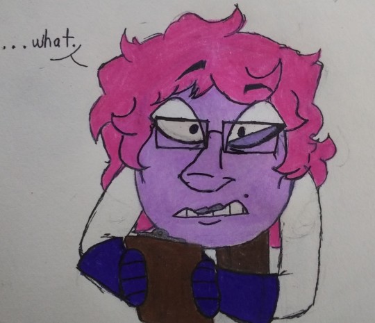
potential redesign for akahiro bc me?? being indecisive when it comes to character design???? It’s More Likely Than You Think
he’s probably reacting to some bullshit one of his brother-in-laws just tried running by him. it’s probably betrayus but tbh it could be either of them
bonus: quick sketch of pre-war era akahiro n orbitalia being In Love and all that sappy nonsense under the cut
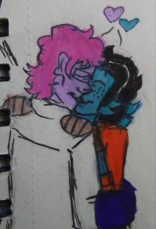
#pmatga oc#pmatga#pacman and the ghostly adventures#pac man and the ghostly adventures#akahiro murasaki#my art#dw he still gets the white stripes in his hair#i've just decided to save those for his present day design (which i Still haven't drawn yet) when he's like 40+#narratively symbolic design choices n all that
6 notes
·
View notes
Text
The Elephant in the Room
In my previous essays, I have covered how the Kingdom Hearts narrative follows Maureen Murdock’s template of the Heroine’s Journey, as well as how various characters and story elements tie in with the overarching themes of the framework. Before I can continue to dig further into other themes and archetypes, there is something I need to address first. While I have avoided directly touching on the topic in my previous essays, I have now reached the point where it is no longer possible to talk about the Heroine’s Journey in full without acknowledging the elephant in the room:
Romance.
In ongoing serialized stories such as TV shows and video games, conversations about potential relationships in canon are often treated as inconsequential to the overall story. Something that is separate from the main plot. At worst, I have seen fans who openly center a ship in their analysis and theories be dismissed and criticized as biased - or worse, delusional. They are treated as being so obsessed with their pairing that they try to make everything about their ship and jump on any excuse to declare that it’s viable in canon.
Among the Kingdom Hearts fandom in particular, this has often taken the form of someone trying to dismiss other fans’ hope for a ship to be canon by saying that the series is about friendship, not romance.
While friendship is absolutely an important theme in the Kingdom Hearts series, to insist that this is mutually exclusive from depicting the development of romantic relationships ignores the continued presence of canon Disney romances in almost every game in the series. In each “main” game where Sora is playable, he has directly or indirectly been involved in getting those Disney couples together in the KH universe. So it’s not out of the realm of possibility for the series to turn the tables and give some attention to his romantic interests for a change.
A story having other major themes is not mutually exclusive from showcasing the development of a romantic relationship. There are many popular movies, shows, books, comics, and video games in which a romantic relationship plays a central role in the narrative but there are still other plotlines going on that are equally as important as the romance. This is especially true for Disney and Square Enix.
The reason why it’s impossible to fully talk about the Heroine’s Journey without acknowledging romance elements is best encapsulated by this quote from She-Ra showrunner Noelle Stevenson about her show’s endgame pairing in an i09 interview after the release of the final season:
“The show’s not a romance show. It is about a lot of things. It’s about choice, destiny, fighting, tyrants, you know, all of these other things. I grew up with so many stories—like sci-fi and fantasy—that I was so passionate about. And it would be considered no big deal to have the hero get the girl and to have a kiss at the end, without it suddenly becoming a romance or ‘Oh, the shippers got what they wanted.’ It was just a part of the story. And to actually see it be a central part of the plot and to fulfill the arcs of the characters in a way that felt satisfying. I really want to take it beyond ‘Oh, the shippers got what they want.’ Like, it’s not just a ship for me. It is a plot point. It is the necessary conclusion of each character’s arc, separate and together.[1]”
While not every story known to follow the Heroine's Journey features a romance for the main protagonist, those that do make the romance an integral part of the narrative. It’s not something thrown in at the end to please shippers, but a central component of the story. Therefore, when analyzing a Heroine’s Journey story, it is vital to acknowledge and discuss textual support for potential romantic relationships in order to have a full understanding of the narrative.
Even if one is not aware of the Heroine’s Journey, Sora’s repeated interactions with Disney romances indicate that there is a high probability that he will be in a romantic relationship himself by the end of the series. Every story I know of that follows the Heroine’s Journey broadly adheres to a pattern in regards to how the romantic relationships of a main character are set up.
By examining the series through these patterns, we can narrow down who Sora’s endgame romantic partner will be.
Because the themes and character dynamics emphasize resolving internal conflict through balance, the Heroine’s Journey lends itself extremely well to Beauty-and-the-Beast, rivals-to-lovers, and enemies-to-lovers relationship dynamics. A major component of the Heroine’s Journey is the main character learning to accept themselves, and since the Animus as a Shadow figure can represent the parts of themselves that they haven’t accepted yet, it is simpler to symbolize that self-acceptance via a romance with the Animus rather than attempting to build a separate relationship on top of the existing story framework.
For these reasons, the Animus is more often than not the main character’s endgame love interest, their feelings for each other made into critical aspects of their respective character arcs. The only Heroine’s Journey stories with romance that I know of where this wasn’t the case are ones where executive meddling resulted in the finale being rewritten to kill off the Animus despite established narrative set up for them to have a happy ending together[2], while the protagonist was either forced into a relationship with a different character or left single.
And like I said in previous essays, the one character in the series who fulfills all criteria for the Animus role within this storytelling framework….
Is Riku.
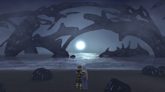
[Image Description: Sora supporting Riku as they walk toward the ocean on the Dark Margin at the end of Kingdom Hearts II. End Description.]
As mentioned in my earlier analysis, this narrative framework emphasizes the importance of balancing contrasting attributes, which fits in extremely well with Kingdom Hearts’ focus on balance between light and darkness. For stories that follow the Heroine’s Journey in a visual medium, that dichotomy is often incorporated into the characters’ look. Height differences are common, while their color schemes and outfits are designed to make them complement each other. Further adding to the focus on balance between light and darkness, the visuals of the story frame the romantic leads with imagery associating each one with light or darkness to create Yin-Yang symbolism when they are finally in balance.
In Re: Chain of Memories, Vexen openly calls Riku the “Hero of Darkness[3]” as a counterpart to Sora’s role as the “Hero of Light”, and their combination attack in Kingdom Hearts II utilizes moves that reflect both elements. In the Ultimania for the original game, Tetsuya Nomura said that Riku’s look was intentionally designed to balance Sora’s[4], and the contrast between their respective color schemes is maintained in each of their new outfits. In Kingdom Hearts II and Dream Drop Distance, Riku wears white and blue, while Sora in those same games wears black and red. Two different pairs of contrasting colors. Kingdom Hearts III has them both in outfits that are primarily black and grey, but still emphasize the blue and red that have been part of their respective outfits since the first game.
In a Heroine’s Journey, the love interest is typically an active character in the story and usually serves as the deuteragonist. This fits with Riku having been a mandatory playable character in multiple games since 2004. In addition, series producer Shinji Hashimoto said before the release of the HD 1.5 Remix collection[5] that the main focus of the series is how Sora and Riku develop both as individuals and as a pair, which fits with how the central conflict of the Heroine’s Journey revolves around the dynamic between the Protagonist and their Animus.
A common viewpoint held by many fans of the series is that Kairi is Sora’s love interest, and it’s not hard to see why people get that impression. He has sacrificed himself to save her in two separate games now. He’s charged enemies head on in order to rescue her whenever she’s been captured. He even got down on his knees and begged for her freedom when Saix demanded he show how important she was to him. Multiple characters have talked about how special she is to him, and Roxas refers to her as “that girl he(Sora) likes.”
However, there are multiple elements in the narrative that point to them not being the endgame romance. Kingdom Hearts III foreshadows the final shot of them sitting on the paopu together at the end of the game with Sora disappearing from the cover of the 100 Acre Wood storybook, textually framing Winnie the Pooh as a parallel to Kairi. While many fans regarded their sharing paopu fruits in the base game as the beginning of a relationship between them, he still only refers to her as a friend in Re:Mind, and even compares his bond with her to the bond between Ventus and Chirithy.
Sora also does not treat his promises to her with the seriousness he would if they were going to end up together. The promises to return her lucky charm and to come back to her that he makes in the first game are never treated as anything urgent when he awakens in Kingdom Hearts II. Instead, he declines the opportunity to return to the islands and check in with her in favor of searching for Riku. When Kairi says in The World That Never Was that they’ll be together every day, Sora agrees, yet he was content to spend the rest of his life on the dark beach at the end of the game as long as he was with Riku.
Meanwhile, the most consistent theme regarding Kairi in relation to the Destiny Islands trio is the idea of childhood friends drifting apart as they get older[6][7]. This is particularly highlighted in Kingdom Hearts III, with Kairi writing letters to Sora that she never sends, thereby keeping her thoughts to herself. Merlin also emphasizes this when he talks about forging new connections after Sora’s visit to 100 Acre Wood. This parallel frames the ending of Re:Mind as the two of them recognizing they’ve drifted apart and choosing to put in the effort to renew their friendship by spending time together.
On a structural level, her portrayal does not fit with how love interests are typically depicted in the Heroine’s Journey, both as an individual and in relation to the main protagonist. There is no contrast between her and Sora’s designs or roles the way there is between his and Riku’s. Her color scheme is predominantly pink, which does not have the same contrast with Sora’s red as Riku’s blue. Because she’s a Princess of Heart, there is no dark and light contrast, and the combination attack she shares with Sora in Re:Mind only utilizes light-based moves. It took 17 years after her first appearance in the series for her to be made a playable character, and even then, playing as her is not mandatory. They are never portrayed as equals, and she is not an active force in his emotional growth.
The Heroine’s Journey was crafted for narratives revolving around identities that have been Othered by society for one reason or another. Murdock designed her template as a tool to help women deal with being shamed by society for expressing and pursuing their desires. In a similar way, LGBTQ+ people also face stigma from society for expressing and pursuing their desires. So it makes perfect sense that a framework for narratives of people overcoming internalized stigma against important parts of themselves would be ripe for stories featuring LGBTQ+ protagonists of any gender.
As mentioned in previous essays, stories that follow the Heroine’s Journey challenge the biases and blind spots of the audience. A relationship between Kairi and Sora does not challenge anything because she has largely been regarded as the endgame love interest by default since the beginning. Meanwhile, a romantic relationship between Sora and Riku challenges players to recognize heteronormativity within themselves and in the media around them. It challenges people to examine the lens through which they perceive the story and rethink how they look at what’s happening in the narrative.
In summary, the portrayal of Kairi and her bond with Sora is not consistent with how love interests are commonly depicted in the Heroine’s Journey, while the portrayal of Riku and his bond with Sora is. If Sora’s story is going to continue on this storytelling formula to the end, the structure of the Heroine’s Journey narrative leaves Riku as the only thematically viable candidate for the role of endgame love interest.
Now, as some people bring up in conversations about Soriku, there is a potential obstacle in the form of corporate executives. It is entirely possible that Disney will drag their heels and try to force the development team to downplay or remove any open same-sex relationship the series may try to depict. They do not have a strong track record of LGBTQ+ representation that isn’t a minor character who only appears for one scene. Given that their last IP to follow the Heroine’s Journey - the Star Wars sequel trilogy - crashed and burned at the end, executive meddling is my greatest fear for this franchise.
But the thing to keep in mind is that Tetsuya Nomura is stubborn as hell. One of the reasons the long gap between Kingdom Hearts II and Kingdom Hearts III was because he was holding out for permission to include Pixar movies in the game, outright refusing to start work on KH3 until they were given that go ahead[8]. If you want further proof of how stubborn he can be, this is how he described the meeting where he first pitched the series to Disney in a 2012 interview with the late president of Nintendo[9]:
Iwata: Their ideas were different from yours, naturally…
Nomura: Yes. They appeared to believe that we would make whatever they wanted us to make and came up with rather specific requests such as, "We'd like the game to feature this character." They were really excited, explaining their ideas... To be honest, though, I wasn't really interested in any of them. (laughs)
Both: (laughter)
Iwata: You wanted to borrow Disney's characters in order to make a new game that could compete with Mario 64, and you already had a vision of what this game would look like. I suppose their ideas didn't fit in with this vision.
Nomura: They didn't, no. In the end, I actually stopped a presentation halfway through. We didn't have that much time, and it looked like it was all going to get taken up by various Disney presentations. So, I interrupted them and told them the conclusion by saying, "I won't make such games."
Talk about nerves of steel. This man basically said “we do this my way, or we don’t do it at all” TO MOTHERFORKING DISNEY, AND. HE. WON. If there is any human being with enough force of will to make the Mouse House cave in and allow the depiction of an openly LGBTQ+ relationship in the Kingdom Hearts series, it is Tetsuya Nomura.
I cannot say with 100% certainty how things will go. But everything I know about storytelling patterns and narrative structure is telling me that Kingdom Hearts is a textbook Heroine’s Journey with a romance between Sora and Riku at its core. A relationship between the protagonist and the Animus does not truly begin until the “Integration” stage at the end of the Journey, and we are rapidly approaching the point in the narrative where the two leads traditionally become aware of and acknowledge their feelings in order to be on the same page for the finale.
Sources:
[1] “She-Ra's Noelle Stevenson Tells Us How Difficult It Was to Bring Adora and Catra Home” May 18, 2020
https://io9.gizmodo.com/she-ras-noelle-stevenson-tells-us-how-difficult-it-was-1843419358
[2] “Death of a Dark Youth, Desecration of the Animus”; December 20, 2018. https://www.teampurplelion.com/death-of-a-dark-youth/
[3] Kingdom Hearts Re: Chain of Memories. Square Enix, 2007.
[4] “A Look Back: Kingdom Hearts Ultimania Gallery Comments Part 1″; August 30, 2019;
https://www.khinsider.com/news/A-Look-Back-KINGDOM-HEARTS-Ultimania-Gallery-Comments-Part-1-15519
[5] “How Kingdom Hearts III Will Grow Up With Its Players;” September 24, 2013.
https://www.ign.com/articles/2013/09/25/how-kingdom-hearts-iii-will-grow-up-with-its-players.
[6] “E3 2018: Tetsuya Nomura on If Kingdom Hearts 3 Is the End of Sora's Story”; June 14, 2018.
https://www.ign.com/articles/2018/06/14/e3-2018-tetsuya-nomura-on-if-kingdom-hearts-3-is-the-end-of-soras-story
[7] “Character’s Report Vol. 1 Translations”; Jul 16, 2014
https://www.khinsider.com/forums/index.php?threads/characters-report-vol-1-translations.195560/
[8] “Edge Magazine Features Kingdom Hearts III Cover Story”; January 9, 2019. https://www.khinsider.com/news/Edge-Magazine-Features-Kingdom-Hearts-III-Cover-Story-14331
[9] “Iwata Asks: Nintendo 3DS: Third Party Game Developers, Volume 12: Kingdom Hearts 3D [Dream Drop Distance], Part 2: It’ll definitely be fun”; April 2012.
https://iwataasks.nintendo.com/interviews/#/3ds/creators/11/1
#kingdom hearts meta#kingdom hearts theory#kh speculation#kingdom hearts analysis#kingdom hearts and the heroine's journey#soriku
74 notes
·
View notes
Text
Carlos Santana Shoes: Where Music Meets Fashion
Carlos Santana, celebrated as one of the greatest guitarists of all time, is not only a musical genius but also a visionary in the world of fashion. Beyond his illustrious career in music, Santana has channeled his passion for style and self-expression into creating a line of iconic shoes. Carlos Santana shoes are a testament to his unique blend of creativity, spirituality, and cultural influences. Let's explore Santana's style of sneaker shoes and what inspired him to venture into the world of footwear.
The Fusion of Music and Fashion
For Santana, music and fashion are inseparable forms of expression. Throughout his career, he has consistently pushed boundaries, fusing various genres to create a sound that is entirely his own. His music transcends cultural and stylistic boundaries, drawing inspiration from rock, Latin, blues, and jazz.
Santana's signature sound has always been accompanied by a distinctive sense of style. Known for his bohemian attire, Santana embraces a blend of influences, incorporating elements from his Latin American heritage, spirituality, and a rock 'n' roll edge. His fashion choices reflect his personal journey, embodying freedom, individuality, and a connection to higher realms.
The Birth of Carlos Santana Shoes
Driven by his love for fashion and a desire to extend his artistic expression beyond music, Carlos Santana embarked on a new venture in 2005 – the creation of his eponymous shoe line, Carlos by Carlos Santana. This endeavor allowed him to merge his passion for music with his innate sense of style, resulting in a collection of sneakers that embody his spirit and resonate with fans worldwide.
The Unique Style of Carlos Santana Sneaker Shoes
Carlos Santana sneaker shoes are a true reflection of the artist himself. They combine elements of streetwear, rock 'n' roll aesthetics, and Latin influences to create a distinctive and dynamic style. Santana's love for vibrant colors, bold patterns, and intricate details is evident in each pair of sneakers.
These sneakers often feature eye-catching designs, including geometric patterns, floral motifs, and cultural symbols. The use of unique materials, such as denim, suede, and leather, adds depth and texture to the footwear. Metal accents, embroidery, and other embellishments further enhance the visual appeal of Carlos Santana sneakers, making them a statement piece that effortlessly elevates any outfit.
Inspiration and Spiritual Connection
What sets Carlos Santana shoes apart is the deep-rooted inspiration and spiritual connection behind their creation. Santana's music has always been driven by a higher purpose, aiming to transcend barriers and unite people. Similarly, his shoe designs reflect a spiritual and soulful energy.
Santana draws inspiration from his belief in the power of love, unity, and self-expression. He incorporates elements of his spiritual journey, infusing his sneakers with positive affirmations and symbols that represent harmony, peace, and enlightenment. By wearing Carlos Santana sneakers, individuals become part of a larger narrative, one that promotes authenticity, self-discovery, and personal growth.
The Impact of Carlos Santana Sneakers
Carlos Santana sneakers have made a significant impact in the world of fashion, captivating a diverse audience. They provide a platform for individuals to express their individuality and embrace their unique style. The sneakers have become a symbol of self-confidence, artistic expression, and a celebration of cultural diversity.
Beyond their stylistic appeal, Carlos Santana sneakers have also made a positive impact on society. Santana's commitment to giving back is reflected in his shoe line, as a portion of the proceeds from sales goes to support various charitable initiatives. This dedication to making a difference further amplifies the significance of Carlos Santana sneakers and the brand's mission.
In conclusion, Carlos Santana sneakers are the embodiment of Santana's unique style, his spiritual journey, and his passion for self-expression. Through these shoes, Santana extends his artistic vision beyond music, allowing individuals to embrace their individuality and create a personal statement through fashion. Carlos Santana sneakers merge the worlds of music and fashion, uniting people through style and inspiring them to embrace their true selves.
0 notes
Text
“Land of the Blind” and Sam Chung’s "Selfish” Heroism
We are rapidly moving into the “Mayor Fisk” Legacy arc of Soule’s DD run, but we wanted to take a minute to reflect on the previous arc, “Land of the Blind”, as it marks a turning point in Sam’s story.
A major recurring theme so far in Sam’s development as a hero is the idea of selfishness. He struggles-- in an all-too-relatable way-- with the reality of what it really means to risk your life for others. It’s easy to claim selflessness, but much more difficult to muster the courage to actually perform it. When Sam found himself alone against Muse earlier in the run he made the choice to stand his ground and act as protector for Muse’s victims, and this choice ended up costing him his sight. Having disappeared from the story for a while, he returns in issue #26 having made some peace with this failure-- through having his vision restored, but also by deciding that he can live with being a little bit selfish.

Sam: “I told you it was worth it. But what was I supposed to say? I’d have traded all those people I saved just to keep my sight? Maybe just one of them? Or ten? Lying in that bed, bandages on my eyes, that’s all I thought about. How many? Three, Mr. Murdock. That was the number I came up with. I would have let three of those people die to save my eyes from Muse.”
Daredevil vol. 5 #27 by Charles Soule, Ron Garney, and Matt Milla
The Sam who Matt encounters in China is a bitter, angry, unrepentant version of his former student. Forced to come to terms with the destruction of his idealized dreams of being a superhero, and embroiled in Hand training and ideologies, he is now angry at Matt’s failures as a teacher and willing to accept his own perceived flaws. Sam sees himself as a fallen hero, and thus is willing to behave in a non-superheroic manner to avoid further suffering.

Sam: “I’m sorry, Mr. Murdock. My mother made a deal with the Beast for my eyes. I made another deal for her.”
Matt: “N-no. Sam... the Beast is... evil. Don’t give it your... soul...”
Sam: “I didn’t give the Beast my soul, Mr. Murdock. I gave it yours.”
Daredevil vol. 5 #27 by Charles Soule, Ron Garney, and Matt Milla
Accepting his “selfishness” informs this whole arc; Sam’s mother offers the Beast her soul to restore her son’s eyes, and then Sam offers up Matt’s soul to save his mother’s. It’s a jerk move, and he knows it-- but he values his mother’s life more than the so-called heroics that dropped him into this situation in the first place. One of Sam’s other main themes is family, after all, and protecting his is his priority.
All of this sets up for Sam’s big change of heart-- the regret for what he has done to Matt, and the realization that he can’t actually live with being quite this heartless. Ultimately, he makes the decision to try heroism one more time-- maybe not for the sake of being a Hero(TM), but because despite the disaster with Muse, Sam still values his partnership with DD and-- most importantly-- he thinks of Matt as family. Once more, he takes that impossible risk of placing someone else before himself-- and once more, it has disastrous consequences. Losing Daredevil as payment, the Beast consumes Sam’s mother instead, resulting in the most stunning sequence in the story arc:


Daredevil vol. 5 #28 by Charles Soule, Ron Garney, and Matt Milla
So far, it seems Sam has two choices: to protect his personal interests, or to become a superhero. The narrative has not yet allowed him to do both, and that’s heartbreaking. But for the moment, he has accepted his connection with Matt once more, if only because Matt is now some of the only family he has left. As painful as it was, he made a choice, and that choice might be seen as somewhat of a superhero origin for him. It will certainly inform where he goes from here.

Sam: “I designed an invisibility suit. I should have sold it to some tech company for a billion dollars. But I didn’t, because I’m not legal in the U.S. I thought they’d take it away from me, cheat me. I figured if I became a hero, one of you guys might help me. Tony Stark, maybe. I didn’t become Blindspot to help. I did it because I’m selfish, to become valuable.”
Matt: “Valuable? Sam, you were always--”
Sam: “You don’t see it. You’re from there. You take it for granted. I could lose everything at any time. Get deported, lose my whole life.”
Daredevil vol. 5 #28 by Charles Soule, Ron Garney, and Matt Milla
The story then circles around to the theme of “selfishness” from a new angle. Sam struggles to think of himself as a hero, of reaching that idealized image that superheroes once embodied for him, because he can’t risk not placing himself first. As an undocumented immigrant he is in danger simply by existing. Thus, any step he takes into the spotlight as Blindspot, no matter how small, is an act of courage and selflessness. Sam is fighting for his own legal and symbolic personhood and significance (to make himself “valuable”, as he puts it)-- a goal both heroic and inherently “selfish”-- which is a powerful concept for a superhero. The story cuts off abruptly to make way for the “Mayor Fisk” arc, but we are excited by where Sam has ended up, and eager to see how he handles the fallout of this plotline when it is picked up again.
54 notes
·
View notes
Text
Reading #Stitchwitchery: Sewing & Magic in Fantasy
https://ift.tt/2ldHWH1
We take a look at the use of sewing in fantasy novels the Unraveling Kingdom series and Spin the Dawn.
facebook
twitter
tumblr
Sewing is a bit arcane for people, like myself, who aren’t particularly good at it. I can sew badges onto a Girl Scout uniform and hem pants if pressed, but create a whole new article of clothing? It’s beyond me.
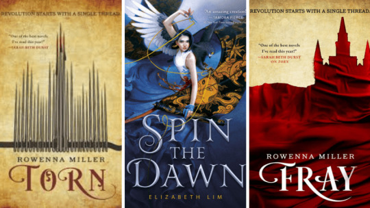
There are plenty of wizards in my social circle who have this skillset, and it always strikes me as magic, so when I encountered Torn by Rowenna Miller last year, I thought it was absolutely appropriate to have the main character as a seamstress who casts charms through her stitching. Since then, two more #stitchwitchery books have hit the shelves: Fray, the second in Miller’s "Unraveled Kingdom" series, and Spin the Dawn, an #OwnVoices series launcher by Elizabeth Lim that adds a Mulan flavor to an original fairy tale.
read more: 7 Epistolary Time Travel Novels
Rowenna Miller’s "Unraveled Kingdom" series, set in a country loosely reminiscent of revolutionary-era France, depicts a fraught nation in which the common folk feel underrepresented and mistreated, and the out-of-touch nobility appear to lead lives of wealth and leisure.
Sophie Balstrade, once a street urchin, has pulled herself up by her bootstraps to become the owner of a couture shop that caters to the same nobles her brother, Kristos, despises. She indulges Kristos’s political grumblings, even attending meetings with his friends, but she’s always struck by how the men calling for reform forget the needs of women.
read more: Best New Young Adult Books
For Sophie, her hard-earned stability is worth suffering the occasional indignity (such as waiting for hours in line to renew her business license, at the pleasure of the Lord of Coin). When Kristos asks Sophie to make red caps charmed with protection, she relents, making a few, all the time realizing that if her brother and his friends have a symbol, their movement is getting larger and more dangerous.
At the same time, Sophie is creating charmed undergarments for Lady Viola Snowmont, a trendsetting young noble whose salon encourages other young nobles to discuss economics and philosophy. Sophie is quite taken with Viola, and even more taken with Theodor, a duke and prince, who begins to court her, even though Sophie believes it can amount to nothing.
read more: How Red, White, and Royal Blue Hopes For a Kinder America
As Sophie comes to get to know nobles as people, she realizes her own prejudices about the nobility—and helps them to see why the commoners are so dissatisfied (while always remaining neutral herself). When her neutrality is threatened by a nefarious revolutionary who forces her to use her charm magic to cast a curse, she keeps it secret, looking for ways to undermine the coming violence and undo the damage she herself has become responsible for.
By the end of Torn, Sophie has only barely moved beyond her frustrating neutrality and prioritizing stability. After the events of the novel, she comes to realize that she can’t remain silent against injustice simply because it threatens her own security.
read more: Paper Girls Series Ordered at Amazon
In Fray, Sophie begins a new chapter of her life as she accepts Theodor’s proposal, the two of them trying to create a symbol for their torn nation: there can be unity between the nobility and the commoners. At the social events Sophie is required to attend as Theodor's betrothed, she works to bring the voice of the common people, whom she once refused to represent, to the ears of nobles who might be bent toward listening.
In the book, Theodor is presenting a Reform Bill that will address the grievances of the common people, because he believes that the duty of the nobility is to serve the nation and her people. But the nobility are hard to move, and even after the Bill passes—something Theodor believes will keep the nobility in line, because who would break the law?—the nation continues to fracture into violence.
read more: An Interview with Teen Titans Raven Author Kami Garcia
Sophie’s magic is tantalizing with its potential—something seen by both her allies and her enemies. While early on, she has only ever cast charms, drawing golden positive light along her stitches to embed particular types of goodwill into her creations, over the course of Torn, she learns to cast curses. Presented as a duality in Torn, Sophie learns in Fray that curses and charms aren’t necessarily opposing forces, but two sides of the same energy, existing in balance with each other.
Sophie is the only person in the narrative who can channel those energies through her sewing, but the way she plays with the magic, weaving it when it is produced by others, drawing it to her as though threading a needle, is always through the lens of her gifts as a seamstress. Even her analogies about the nation are centered around the way that fabric rips, and can be mended. Fray leaves Sophie’s country still unraveling, and the third volume in the series will hopefully chronicle the new cloth emerging from the tattered remnants of an old society.
read more: Best New Fantasy Books
Spin the Dawn doesn’t question the hierarchy of the nation in the same way "Unraveling Kingdom" does, but it lingers in commentary on war, and how threading peace through a war-torn nation takes greater priority than the needs of any one of her people.
In Spin the Dawn, the young Emperor and the shansen—a formerly loyal warlord—battled for five years before finally reaching a truce: the Emperor would marry the shansen’s daughter, weaving the two enemies together. But Lady Sarnai has no interest in wedding the Emperor. Her father had once promised her he would never marry her off for politics, and she’s determined to make the betrothal as difficult as possible, putting off the wedding through a contest to choose the court’s next imperial tailor.
read more: Most Anticipated Non-Western Fantasy Books of 2019
Maia Tamarin has experienced the costs of war. Though her father’s decline as a tailor began with her mother’s death from illness, their family is cut apart further when her two elder brothers are killed in battle. As a girl, she can never officially take over her father’s shop, though she has a natural gift for sewing, and she has been managing her father’s business and completing all the labor for years.
When her last brother returns from war broken—his legs are damaged, and he can no longer walk without assistance—she wonders if, for the good of the family, she should just accept the vaguely threatening proposals of the neighboring baker’s son. When a representative of the Emperor demands that her father compete for position of imperial tailor, Maia knows her father can’t go—but they can’t say no to the Emperor either. She poses as her brother (who offers her a quick lesson in how to act less demure), and sets off for the palace with a gift from her father: her grandmother’s scissors.
read more: Everything We Know About the Children of Blood & Bone Movie
The scissors, of course, are magic, but not the type just anyone can use. The scissors channel Maia’s natural talent, saving her from the disaster of one of her projects being destroyed by a competitor. At first, she is reluctant to use them, feeling as though using magic is cheating. But, then Lady Sarnai demands she make the three dresses of the goddess Amana: one stitched with the laughter of the sun, one woven with moonlight, and the third sewn with the blood of the stars. With the help of the enigmatic Edan, Lord Enchanter, she journeys to gather the impossible materials.
The structure of the novel has the feel of a fairy tale: gather the three impossible ingredients to complete the impossible task. But the richness of the world, populated with demons and immortal enchanters who sacrifice their freedom in exchange for their powers, floods the novel’s pages. Maia, like Sophie, thinks in terms of her sewing, describing the world in metaphors that involve thread and stitches. Though the novel is young adult, and it is a coming of age story, Maia is nearly an adult at the start, and her coming of age is more a coming into her own power—her willingness to take fate into her own hands—than it is about growing up.
read more: 9 Fantasy Books Set at Magical Boarding School
Spin the Dawn ends at a terrible moment. Maia has begun to face the consequences for saving the man she loves—and the second book is likely to delve farther into her magic as she pays the price for her choices. But the gods of Maia’s world are not silent, and the powers she wrangles with are not only the battles of men vying for power, but gods and demons and the order of the world. Magic is huge and powerful and terrifying in a way that Sophie’s hasn’t yet achieved—though, in Fray, the potential for such great magic becomes clear.
Both women design their own patterns for a future where the ones they love will be safe. And I’m eager to continue to follow them as they weave those new worlds, no matter what the cost.
Alana Joli Abbott writes about books for Den of Geek. Read more of her work here.
facebook
twitter
tumblr
Feature Alana Joli Abbott
Jul 13, 2019
Fantasy Books
from Books https://ift.tt/2LPgbQg
0 notes
Text
Capstone Process Blog 02/19/19
Keenan Hursh
EDPX - 3990
Research and Inspiration:
N/A for this past week. I have been developing and polishing my assets.
Progress and process:
I Have written and implemented a narrative into my film:
I wanted to open with the portrayal of our current situation as a species and then address exactly why the Mycelium Collective exists and what we plan to do to address said situation. I want this video to be short, sweet, and to the point. It should highlight and communicate exactly what we do in a simple and effective manner
(each bullet point is an individual scene)
As a species and planet, we currently face a growing and imminent threat.
Earth’s climate is warming and changing faster and more unpredictably than ever before.
Our planet, the only home we have ever known, is on a grave and deteriorating path.
If we stand any chance of saving our world and all of Its beauty
We need to act now!
We need to collaborate and innovate together!
The Mycelium Collective is a brand-new platform that connects and supports our worlds creators.
We support any medium of creation that is themed around environmental sustainability or the outdoor world.
If you have a story to tell or a perspective to share, please reach out!
We’re looking for as many artists and activists as possible to address our collective future.
The Mycelium Collective (all white logo)
Connecting and Supporting our Worlds Creators
example of closing scene with the all-white logo and our slogan.
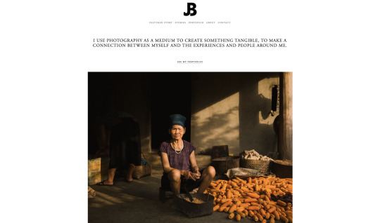
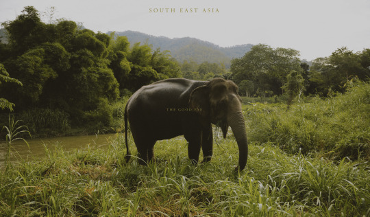
I have also started reaching out to potential collaborators within my immediate social circle. I plan to build the base platform and develop credibility utilizing my own personal connections before expand outwards and beyond to other artists. The first creator I plan to collaborate with is my friend Josh Bennett who is an avid photographer and photojournalist. He takes beautiful photos of natural environments and does an exceptional job of telling his own story of a place. Josh has a unique perspective and eye, and I believe he will make an excellent collaborator who will produce intriguing and beautiful content.
Here is a link to his website:
http://joshbennettphoto.com/new-cover-page-2
Here are some screenshots of his work:
I have also updated and simplified the website based on feedback from last weeks critique. I agree that I was spread to wide and thin, and need to focus and expand on fewer, more essential aspects of the platform. I removed the “shop/support” page as well as the “public/blog” page. These could potentially be avenues to explore in the future but for now I agree that they are distractions from the purpose of this platform.
Reflection:
Over the past week I have been refining and simplifying the website. I removed a couple of unnecessary sections/pages that are more or less distractions at this point. I need to simplify the website and strengthen the few sections that are currently there. In order to do this I have began reaching out to potential collaborators within my social network. I have reached out to a couple photographers and videographers and have one confirmed collaborator. I plan to continue to find artists so that I can not only fill the platform/website with assets but also support like-minded individuals.
Feedback from Last Week:
Laleh and Cherish:
right now the website is a big mix of things. Need to simplify and unify.
Get rid of the shop section, it is too much and takes away form your concept and legitimacy
Need to more clearly communicate your mission and goal. Need to clarify what the collective is themed around or is focusing on
Get rid of the public/blog section. It is also too much right now. Not necessary at this point and is kind of distracting
Some of your shots and text have too long of a run time. Need to shorten some stuff so that the video doesn't drag on.
Keep the text but also add narration/audio as well. This adds a human element
Maybe add your face to the video to make it more personal
Need a human element, looks too corporate right now. Too basic
The shots I have are effective and work well. Keep moving in the same general direction
Class Feedback:
I think the font might look a little too stretched for the logo (stretched is fine, but it is obvious here). I am also wondering what your intention behind using the Yin / Yang symbols is. I would just be careful because it can be a very culturally significant symbol, and if you're not using it right, it might come off the wrong way.
Your website is very clean and has lots of different aspects to it. I would maybe consider lessening all the tabs you have and instead focus on adding more to the tabs you have left. I like that you are trying to create a cohesive website for artists to be able to use, share, and experience. The video you have for your website, is it connected to the overall website or is it more of just an example of a video that can be on it? I think it would be really cool if you created more of an abstract video about the environment to really display your EDP skills. Another idea for the final would be to display your website on a tv screen so everyone can see it and scroll through it. Or maybe find a way that people can interact with the website itself and see other people interact with it during the final.
I feel like the headings are too big right now. Once more content is included I think they should be minimized so that the user is not scrolling through a huge image before reaching the actual content.
I really enjoyed the drone shots in the intro video. I'm wondering if you should have a whole tab dedicated to talking about the copyright involved on this site. A lot of photo-sharing sites like Unsplash completely rip the rights from the photographer, but I think for your purposes you should really address valuing the artists work and what copyright would look like on this kind of platform.
Your website is looking really good so far, my recommendation is to showcase your skills from EDP in an abstract video that represents the environment.
The layout of the website is very pleasing to the eye. I think you’re really starting to do well making a brand for it. I really wanna see some promotion like lots of twitter and Facebook stuff and to get the word out there.
I think your greatest obstacle is something you actually can't control: interaction of other artists and engagement from the public. How are you going to incentivize artists to join your collective? How are you going to gain public awareness/prestige? These are questions that need answers, and honestly I don't even know how to begin answering them, not being a business person. The "success" of your capstone project very much depends on factors only other people (the other artists, the public) can control...and to me that strikes me as really risky. I really liked your company's logo, the graphic design there is nice, but right now you have that large white chunk around it at the top of your homepage...that didn't strike me as impactful. I think you might be better off with a natural image at the top of your page (since your focus is on climate art) with the logo floating on top, maybe on a white circle so it stands out. I also liked your video...but in the section of it you showed there was actually a minor text error. It should be "Earth's," not "earths." Definitely have your stuff proof-checked for things like that - we all make mistakes! Finally, personal opinion here, but I think you're kind of missing the mark by having a slightly dated meme as your motif for your sticker/advertising. "Lost in the Sauce" was funny, sure, but I think it has little to nothing to do with your aims as a company, and seeing a meme as your only product will kind of lower people's interpretation of your professionalism and the sophistication of your brand.
I think your website is professional and contained lots of the information. I like your introduction video. The drone shot is very cool. I think lessening the tabs could help the viewers reaching the actual content in a shorter time.
I think your website is a good start but i think you can definitely push the boundaries of Squarespace to make a more unique looking aesthetic. It just feels a little generic (obviously you're going for a minimalistic look, but i think you can make it a little more individual beyond your logo). There were also just generally too many words in the video, the sentences felt a little clunky.
Your website template looks like an inviting design, easy to read, clear layout, but still intriguing enough to want to know more. For the logo, I like the different concepts you incorporated and it’s a really cool design, but I’m not sold on the color choice. It looks nice but is there a reason you choose those blues and purples. I know its been done so much, but you are talking a lot about the world and the environment, and purple doesn’t normally have that connotation but green does, or even a darker blue. For the video I thought it was really well shot, I think audio/narration like Laleh said would help a lot, and in a couple shots be careful where you place the white text cause it was moderately difficult to see against some backgrounds.
So far, I love the design of the website, but I agree with Laleh on the critiques she gave about different sections. What I would suggest is that you revisit the video/videos as well as the pictures and think about how their design could be more indicative of the nature of your collective. It's a collective of environmentally-conscious artists, but the videos and photos don't read that way to me. They're very simplistic nature shots which are beautiful, but not reflective of an artist collective. It'd be nice to see more interesting and dynamic videos, photos, and other projects on your page!
I like that I’m finally getting to see this collective come together. Your piece is more of a business idea than an artwork, so it’s cool to see that perspective. However, I think that in pursuing the business side of things, you’ve lost your artistry. In the video, if the collective is about artists and their artwork, show some artwork—even if its your own, or from EDP students. I agree that a voiceover will help, and having a face to the brand will also help. I also agree with Laleh in that the website has too much going on, and that you should narrow it down. Remember that you can always add things later after you get it off the ground. There’s something about the text in the logo that looks strange to me, like it’s too puffed up or something, I’m not sure, but maybe take a look at editing the design. I think something like a logo should really reflect your brand, and right now it reads like a logo from a website that is just getting started—and you don’t want that. I think you’re at the point where you should start contacting artists about featuring them on your site. You can message people through their websites, their Vimeo, etc. I think having actual artwork there will help.
I think you have a really strong concept for your project! I love the idea of creating a collective. The website has a clean & professional design layout. I think the logo looked balanced in white/black but felt a little chaotic in colors. I wonder if changing gray scale instead of color would have a stronger impact on the logo (maybe not just a thought)
Your website looks great. You have so much information available and it has a great personal quality. This being said I think the colors of your logo are out of place. The entire look of the website is so fresh and clean, but the logo has a cheesy 80s vibe. I love it, but it just doesn't work with everything else especially since this is such a hip company!
I think the color choice you have incorporated into your website fits perfectly with the concept of the collective. I think the submissions for art on your site is an exceptional idea for so many people have no clue where to put their artwork. Of course there is red bubble and etsy, but no where specific to nature and sustainability, at least that I know of. I really liked the video you composed for the website as well. I did agree with some that it kind of looks like a welcome to Colorado video, specifically. It would be amazing if you could somehow get some beach shots or even go to a reservoir to get that kind of aesthetic.
0 notes
Text
Pub 231 Journals
Week 1: “What does Design means to you?” (How do you see/ use design in daily life?)
Before taking any SIAT course, “design”, this word just tied with aesthetics, and how we can make something aesthetic and appeal to our eyes.
Now, I believe that design is a process of problem-solving for specific purpose. Other than aesthetic, design combines with functionality and meaning to be a sustainable and effective solution serving for its purpose. Having a core purpose (like what the clients want), designer will do research, brainstorm ideas, select ideas, iterates again and again while reminding the match between product and purpose and creates prototype to test the product. Design is like a journey to create something needed in the world.
Design is a kind of communication to me as well. Our choice of font, colour, composition, text and image are crucial to how well and effective we tell the story, information. How it can attract and be understood is something we have to think about when designing with purpose and target audience. It is like telling a story in other medium indirectly. Therefore, design is like a communication to me and it is designer job to form the most effective communication required by clients.
Week 2: Print Production
Varieties of Paper:
1. Uncoated paper
for business cards, brochures, invitations, books...
have surface textures: wove/smooth, linen, laid...
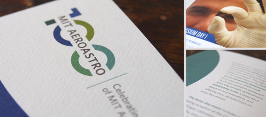
2. Coated Paper
for magazines, brochures, annual reports, advertisements
(not always glossy/ reflective)
variety of finishes: gloss [shiny finish] , satin [good for img], matte [flat finish, ink just lays on top]
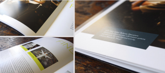
More info: http://designingforprint.com/3-things-to-know-before-you-specify-paper-a-shortcut/
Week 3: Who is a Typographer? (Create a list of typographers, collect an example of work for each: when the piece was done...)
Typographer [Definition]: a person who specializes in the design, choice, and arrangement of type matter (according to Merriam)
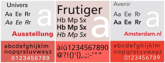
1. Adrian Frutiger (Swiss): An important san-serifs typefaces designer
Univers (1957)
Category: Neo-Grotesque
Similar to Helvetica as both are based on Akzidenz Grotesk
Has variety of weights and widths (flexible!!)
Similar Font: Nimbus Sans, Aktiv Grotesk
Font Pairing: Univers+Glypha
Frutiger (1976)
Avenir (1988)
Category: Geometric
Slightly humanist features: e.g. tail on t; o -->not perfect circle
Similar Font: Neuzeit, Sailec
Font Pairing: Avenir + Century Schoolbook
2. Albert-Jan Pool (Dutch): san-serifs
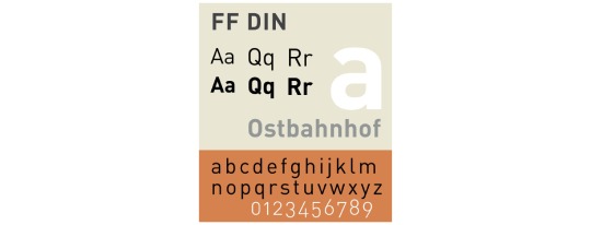
DIN (original version in 1931 for use in engineering and technical applications such as traffic signs)
Linear (1994)
Imperial (1994)
FF DIN (1995)
FF DIN ARABIC (1995)
FF OCR (1995)
FF DIN ROUND (2010)
Similar Font: Interstate, Nudista
Font Pairing: DIN + Aachen
3. Giambattista Bodoni (Italian): serifs --- admirer of Baskerville
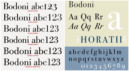
Bodoni (1798):
Category: Transitional—>Modern
Extreme contrast between thick&thin strokes ==> more suitable for display face than a text face
Similar Font: Didot, Modern 216
Font Pairing: Bodoni+Futura
Week 4: What are cool books about design?
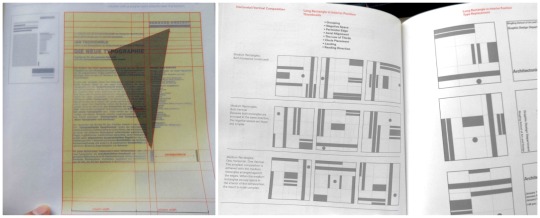
1. Grid Systems: Principles of Organizing Type by Kimberly Elam (2004)
This book mentions what to pay attention when we are designing the layout: proportion of elements, negative spaces, grouping, etc. that affects the overall visual hierarchy. It also provides many ideas on different composition like Horizontal, Vertical and Diagonal Compositions.
One cool thing about this book is that there are pages with grids and instructions that we can see through these pages and analyze the layout on the next page. This is quite helpful.
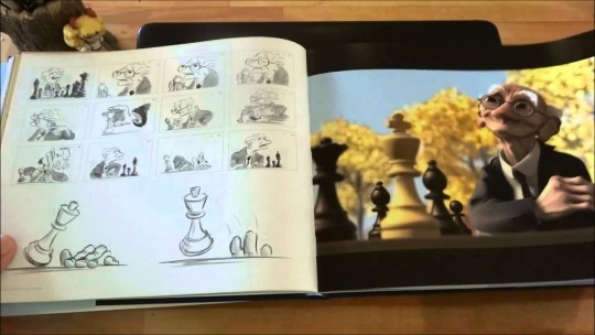
2. The Art of PIXAR Short Films by Amid Amidi (2009)
The book includes characters and storytelling design process of many Pixar short films. From the initial character design: sketches on the facial expressions, motion, modeling, character wireframe in software…to the storyboard of the short film, we can take a peak of the details of these successful animations.
The layout of the book is simple and organized. As it assembled many short animations, it goes in the same flow:
Initial sketches of the character
Notes to pay attention to
Character development (motion and emotion)
Digital visualization (finished work)
storyboard in sketches
Final digitalized scene
The photos are in full bleed and there is a yellow colour page to indicate the start of another short film. It has a dark blue hardcover with the stamped signature of Pixar — Lamp
Week 5: (Type)
Pay attention to:
Remove double spaces
Set italics
Replace hyphens with em or en dashes where appropriate
Remove widows and orphans
Do not break any proper nouns (names)
Do not break with less than 3 characters(what-ever=ok, whatev-er=no)
Do not stack more than 2 broken lines
Check that quotation marks(”) and apostrophes(’) are not primes(")
Adjust loose and tight lines
Set small caps and text figures where neccessary
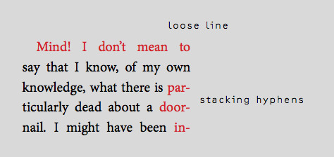
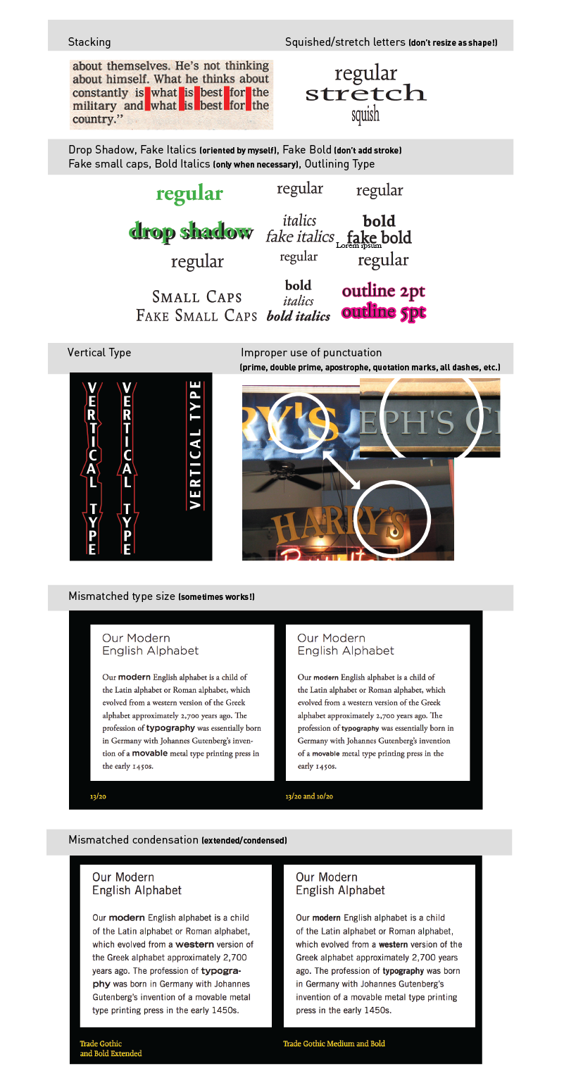
Type Crimes: (ones that I mostly will forget)
Orphan & Widow, terrible rag, double spaces, Improper hyphen break
NOT using appropriate ligature or dot-less i
Negative leading collision
Small caps with lining figures
Full caps with old style figures
Terrible contrast
Text only in all caps (sometimes works!)
Overly tight kerning/ tracking
Overly loose kerning/ tracking
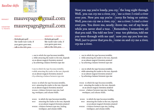
Baseline shift not adjusted (character or line of text)
Use of virgules rather than solidus for fractions
Too many typefaces (be careful of context and execution, sometimes in can work)
Rivers
NOT using hanging punctuation (numbers, bullets, indents, quotation marks)
Baseline shift not adjusted (character or line of text)
Week 6: Think about colour.
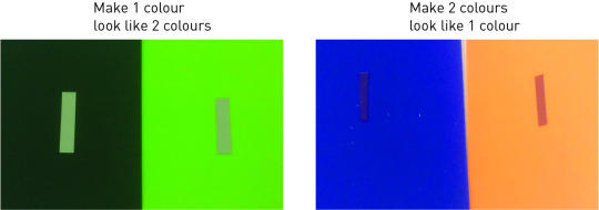
(What were some of your findings from playing with this mixing colour papers?)
For option 1: To find colour from achromatic.
For option 2: Have to match value of two different colours? To choose colours that has close values so it will look the same colour.
Week 7: What are interesting magazine about design?
(Find a design article that intrigued you and write about the most interesting and useful point of the article; take note of when the article was written)
Book Cover Design: (March 25,2019)
https://www.designweek.co.uk/issues/25-31-march-2019/book-covers-that-never-made-it-rejected-designs-revealed-in-new-book/
The article is about a new book called No No No No Yes, which includes 4 versions of book cover that did not make it (4 NOs) and the final used book cover (YES). The article mentions suggestions and reasons why the covers might have won the writers’, publishers’, and other production teams’ heart and why some nice covers got rejected. It is an interesting collection of covers that allows other designers to observe and analyze what clients may be looking for when designing. It is not only about the aesthetic, it is also about the communication of message. Here’s the takeaways:
For printed book:
“But a “direct” and “simple” message and good use of “colour” is often the key to finding a design that works, he adds.”
For electric book:
“so something bold often draws the eye over something restrained”.
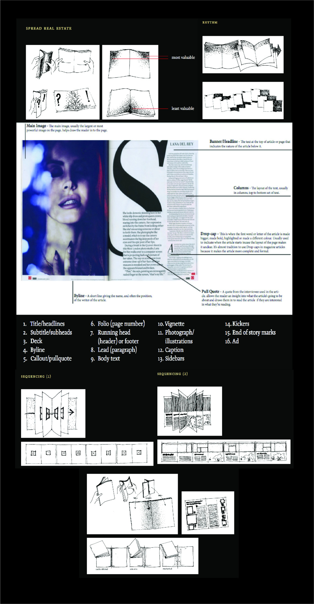
Week 8: Publication design principles
Balance
Proportion
Sequence
Unity
Contrast
Things/Terms that I will probably forget:
Week 9: Find a really good and really bad book or magazine cover; analyze why they are good & bad.
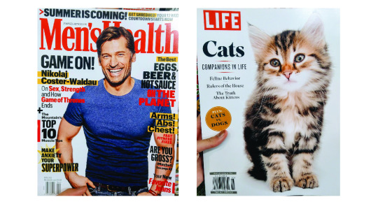
Left Cover (Bad):
Unclear Hierarchy: too much colours, the use of many shapes (star, bars), too many bolded/ highlighted/ drop shadowed word: which is hard to know what is more important as everything seems screaming out
No whitespace, everything is compact: for eyes, this might be too much, tired to read before actually start reading
The only success is probably the use of handsome guy to attract potential customers.
Right Cover: (Good)
Image matching heading “Companions in Life”: Correct image choice as I cannot agree more when looking at its eyes. (using empathy to attract readers)
Simple and clear: The hierarchy, theme is clear. It does not list all the potentially interesting feature articles title on cover. It only puts shape and use different font (probably bolded) typeface to create the contrast, which is simple and on point.
* Both covers interestingly used RED as main heading/theme, which is really popping out and readers can know the theme of the mag immediately.
Week 10-11: AUDIENCE, CONCEPTS & SEMIOTICS
1. Signifier: SFU
2. Signified: education, mountain, expensive
3. Icon: (it resembles the signs or the idea) e.g. F ~ facebook?
4. Index: (direct link between the sign and object; a reference; an indicator) e.g. toilet signs (the cartoon)
5. Symbol: (abstract sign; no logical connection between the sign and what it means; culturally learnt) e.g. country flag
6. Paradigm and Syntagm :
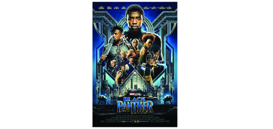
Paradigm: a chain or collection of signs which invoke each other because they are culturally, paradigmatically
Black Panther: power, authority
Syntagm: the structural relation that combines signs in code-specific ways.
Color: blue, gold, silver= wealth, high-technology, weapons, royalty
Size of characters: like the order of importance to the narrative; who got most of the power and who is threatening the power
Hierarchy: top-down, from big to small to title
Symmetrical balance: fight to be a stable, steady country?
The pointing “N” in title to sub-heading: metaphor the use of weapons/ metals, fights for the power
0 notes
Photo
“The Flag House” | Directed by Michael Klick

Right off the block, we would not be HYH if we didn’t note the hat! In this opening sequence it is clear that Quinn is confused and beginning to remember the diner. Klick (who has been the show’s line producer since the series started) and David Klein (director of photography) choose to portray his confused state with the blurry diner as Quinn’s face enters the camera from the right.

It’s not every Sunday we see Quinn checking out a woman’s behind and, well, this just had to be included for posterior posterity. Also, note how the patron is also flirty and the background is a bit dreamy and unfocused as Quinn begins to recall Nicki and his surroundings.
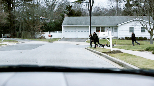
The children were shown playing basketball twice and, it seems clear, there was more to it than simply setting up Quinn’s later conversation with the boy. We know that basketball is Quinn’s sport from “Separation Anxiety,” when he said, “I see you like to use potassium chlorate… but the smell reminds me of the visitors' changing room at a high school basketball game.” Who knows if Quinn ever really played high school basketball given the backstory we have for him now but it seems clear these children, happily and carelessly playing, may represent everything Quinn did not have.
Note that Klein chose to make these shots relatively colorless and stark. The tones are muted with a predominance of gray.

One of the first camera angles Klick and Klein depict of the flag house is, interestingly, from the point of view of the flag itself. One could interpret this as patriotism literally blocking our perspective, or maybe Klick and Klein just thought it would look cool!
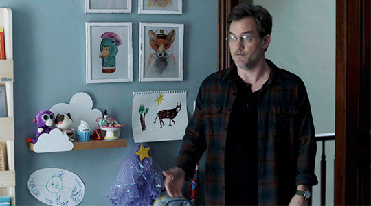
The Works of Franny Mathison #1: “A Cat”
We’re fairly certain the set designers weren’t thinking about Laura’s cat from season five but we just appreciated Franny’s drawing (bottom left) so we threw this in. We’re wondering how many of these were drawn by the twins themselves.
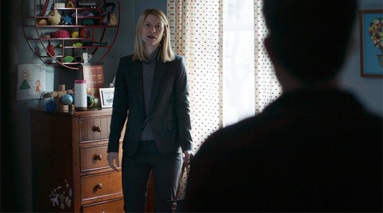
The Works of Franny Mathison #2: “Very Big Mommy”
And while we’re touring the Mathison Progeny Art Gallery, any child psychologists care to ring in on the drawing above the dresser? Carrie is very large compared to a very small and very red Franny. We’re happy Carrie is smiling!
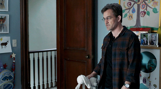
The Works of Franny Mathison #3: “Quinn & Mommy Living in a Tree, K-I-S-S-I-N-G”
Franny uses the evocative color of purple to represent and link those whom she loves the most. We’re kidding, but the “C” and the “Q” in Franny’s tree are the same color. We get that the star nightlight shown early in the season was just a star but this…
maybe, just maybe
(It’s possible Franny didn’t actually draw this one but the artwork in this kid’s room is certainly not to be ignored.)
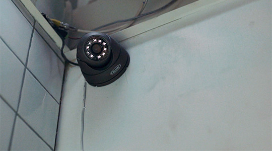
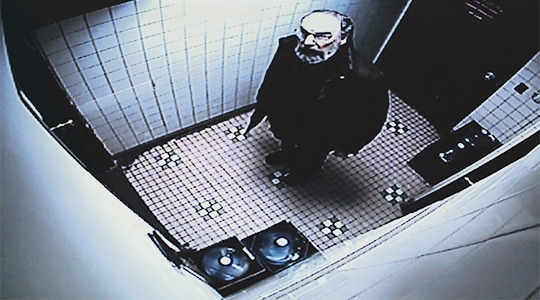
This is pretty standard Homeland with its themes of watching and being watched. Here, however, Klick and Klein shoot Saul looking up at the camera almost like the trapped animal he is. The grey colors are almost prison-like. Saul is, narratively and physically, in a small place, a cornered man in every way.

This, too, is a fairly simple shot of Carrie coming to a dramatic realization. Carrie has a choice: seeing her child or giving a deposition in which she will compromise Dar. Situated almost perfectly between two black and white windows, we understand how she’s caught in the middle.

And, well, the videographer was just plain creepy and reminded us of all those weird side characters on The X Files.
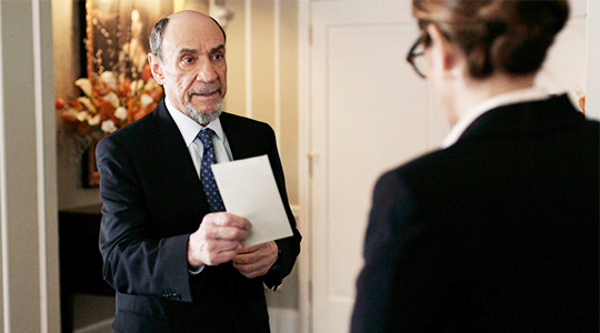
Okay, the letter is just starting to seem very, very weird. Dar is constantly offering, pocketing it, unfolding it. (We know of another letter that seemed to mean a great deal...) We’ve even seen the names when he was in the car last week. First, Dar, please consider email. Second, we’re wondering if there’s more to the letter than meets the eye. Is Dar trying to covertly communicate something to Keane with these names? Are they characters for next season? Any other theories?

Keane’s pose jumped out here as provocative. It’s “man spay” in every way (there are legit warnings against this pose on NYC subways in order to allow seat space for people). Some of us considered this to be a nonsexual version of Sharon Stone’s iconic Basic Instinct pose but regardless, this girl is clearly not bowing to the boys without a fight. Klick likely intended her to look masculine and dominating.

Once in awhile we must take a moment for a man with the solemn hubris and pedigree to pull off what F. Murray Abraham does here. It was a beautiful acting moment. Nothing more or less. Except, perhaps, these may be our last moments with this fine actor who has made us feel so much anger, confusion, and interest over the years.

Again, the flag house is filmed from the inside out with the boy--and, yes, we’re gonna say it--the symbolic maybe-fill-in for a young Quinn John. Quinn was looking at those boys playing basketball with much nostalgia.

It’s a dangerous game of ding dong ditch this boy is playing… and didn’t we all think it was about to be more of a crisis than it was? By the way, what’s the phone number of the CIA landscaper? This winter has been mild in NYC, but still, that’s some nice upkeep.

Arguably the lighting for Quinn’s flashback is rather forced with its blaring yellow tones. This shot, however, is decidedly evocative, with messiah levels of light chosen by Klein. And, again, the window.
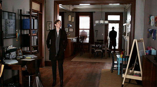
More framed artwork adorns the Mathison household, but this caught Sara’s eye because the photo on Carrie’s desk on the far left is the same one of her and Franny from season four. Sometimes prop continuity is nice.

If we’ve learned from set spying, it’s this: they don’t shoot any frame on accident. So… the church steeple as savior Mira is rushed to Saul may have been intentional. The gray winter landscape and colorless cars (part of the call sheets) were also intentional as Klick painted a wintery, bleak visual narrative.
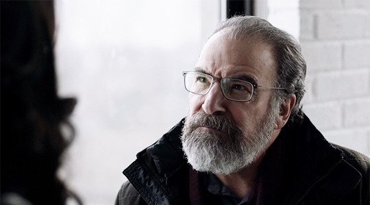
This is the final scene with Mira (ever?) and, Manhattan hazy behind them, she she stands over Saul and asks him, “When has that [humiliation] ever made the slightest bit of fucking difference to you?” God bless you, Mira Berenson.
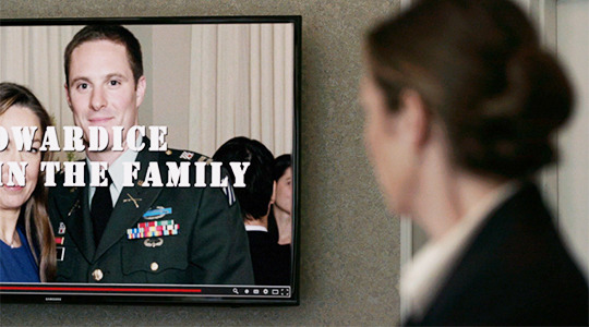
Klick keeps the camera on this shot for a surprisingly long time. Note Andrew, his medals and honors displayed across his chest and the word “cowardice” sitting just above them, his gaze fixed squarely on his mother.

Klick has several frames of the sock puppet troll images cast onto the figures of O’Keefe and Dar. These men are, literally, wearing their own lies. Also, note the continuation of the gray tones within the Onyx scenes.
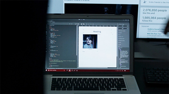
We’re not sure what to say about this but it sure has the fandom buzzing (is Quinn going to be framed?) so we thought we’d throw it in.

These shots were simply beautiful; Saul (in a possible callback to... My Fair Lady? A Streetcar Named Desire?) is almost calling to the sky (the gods?) in search of Carrie in the first shot. The second shot shows the seemingly endless brownstones with Saul at his ultimate destination, Carrie’s home. Note that Carrie’s house lights--on the right of the shot and beside the steps--are the only ones lit on the darkened street. One could argue that it’s Carrie’s home which is the light of “truth,” considering what Saul discovers inside.

Some have argued that it’s meaningful that Saul gets into Carrie’s home from the hole that Quinn, in his paranoia and depression, created in “The Man in the Basement.” Quinn claims to have thought “someone was trying to break in” and it’s ironic that Saul is ultimately the one who does.

Klick chooses several shots of ascending stairs in this episode, and we suspect this is important as all the characters seem to be rising out of the swamp of murkiness as they unravel the conspiracy. The very first shot of Carrie features her and Max making their way up the stairs to Franny’s room. In this sequence, Saul is first shown ascending the basement stairs and then after tea (!) ascends the second set of stairs to Carrie’s hidden room. Finally, when Carrie goes to Quinn in the final scene, she is again shown climbing stairs. (The caveat here is that NYC is a very vertical city.)
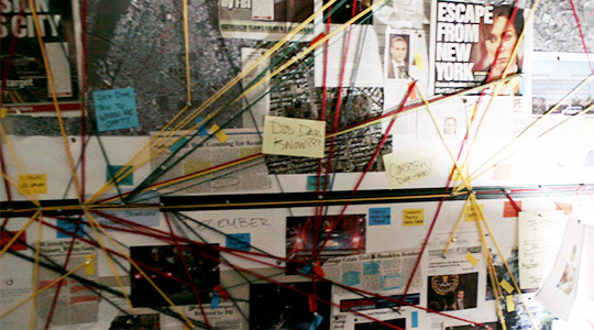
The sweeping panorama of Carrie’s bulletin boards was almost exactly how they shot Onyx’s enormous sock puppet reveal last week. Together with Sean Callery’s score, Saul and the viewer are given access to this surprise underworld of Carrie’s mind: a different kind of conspiracy this time, one in which fragments of truth, instead of lies, are uncovered.

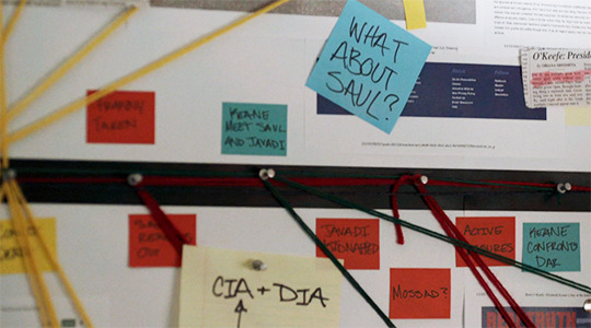

The production designers put plenty of thought into Carrie’s bulletin board. Note that the strings are in primary colors and actually represent a certain kind of logic. The strings and sticky notes that are blue represent Keane (Democrats take note!) while the red represents Dar (Republicans take note!). Yellow seems to represent the FBI.
Fun fact: The news article above has a by-line of John Kretschmer who has been the production designer on Homeland for years.

Again the direction here plays with the glare of Keane’s laptop screen. The lies aren’t projected onto her, as they were with Dar or O’Keefe, but literally reflected back at her (much as they have been with Max). In one of the most heartbreaking moments of the season, Keane comes face-to-face not only with these lies but with her own decision to bring her son out from the shadows and into the light.

As pointed out in past Director Chair features, Klein loves his blues, and the final scene was beautifully backlit with the blue tarps surrounding the house creating almost a sci-fi feeling. Blue, notably, is often associated with clarity as all the pieces start to fall into place (which is the actual logline for the finale, by the way).
As noted earlier, Carrie ascends the stairs to get to Quinn who has his own truths to reveal. The use of her cell phone light here is almost star-like. That’s likely a notable choice by Klick and Klein because so often flashlight sequences depict a long beam of light. In this shot, however, Carrie emits a single point of light.

Only Homeland could make a close-up of an assault weapon seem so beautiful. Note, again, the circle of light in the distance.

One of the final shots of the episode depicts Belli in the bullseye in an eerie mirror of his own targeting of Astrid in “alt.truth.” Strangely, Belli appears to be looking upward, not at the group seated all below him, but across the street to Carrie and Quinn, who are waiting in the wings.
34 notes
·
View notes
Photo
Logan: A Discussion
Sorry for the delay; we’ve been sitting on this since opening weekend. You know how life can get. Enjoy
Before:
Weird Beard: Alright, what are your thoughts going into this film?
Bunnypwn Gold: My first thoughts going into Logan are optimistic. I liked the early X-Men films, but honestly I wasn’t happy with the soft, sentimental Wolverine we got because he never had a chance to be the stone cold badass we all know and love. The solo Wolverine films were weak and basically were about “Wolverine is good at killing things with his claws!” instead of having an actual plot. That’s such a cliché idea that it’s been his catchphrase for two decades at least. Logan, though, looks different. I was expecting it to be as mediocre as the others, but the trailers and advanced info changed my mind; they focus on him as a person, where he’s going, and what his plans are with Laura more than showing him cutting people up. I expect that he’ll be doing a lot of that anyway, so I don’t need to see it in the trailers if there’s really anything else to the film. I think I’ll be pleased with Logan.
WB: Yeah, when this was first announced, I thought, ‘Oh, here’s going to be another dud, because the first two Wolverine films are garbage.’ That isn’t to say that they didn’t have cool details within them, but that they were just poorly made and thought out. But then, I saw the first trailer and I was like, ‘That was a great trailer for what’s going to be a crappy movie. At best, it will be a watchable but otherwise forgettable film.’ So yeah, I definitely was not really paying much attention to the news about it or really looking forward to it in a way beyond maybe seeing a cool trailer. It wasn’t until reviews for it started coming in that I started to get hope for it. My bar for success for this film before the reviews was whether it was coherent, which is the most basic thing you should expect from a film. After the reviews, I started looking forward to it, and not simply because they were positive, but that people were saying it was easily one of the best superhero films.
When people started saying that about it, I started to be more interested in it.
So, have you seen both of the last Wolverine movies, or just Origins?
BPG: I didn’t see either of them. I was going to see The Wolverine, but I kept hearing everyone say it’s silly and underwhelming.
WB: Yeah, it’s superdumb. Like, it had the parts to be a cool film: Japan, ninjas, traumatic past haunting our hero, a conspiracy involving Silver Samurai. But then it was like the producers and everyone decided it would be better to just do everything in the most boring way possible.
I think I hate it more than Origins simply because you can see the working parts that would have made it a decent movie, whereas Origins was just a fucking mess from page one of the script to the final studio executive mandated edit.
Oh, and I really don’t like that Silver Samurai was not an actual samurai.
Oh wait, I was wrong. There was some samurai dude in there, but it was not a good take on him.
BPG: I saw the ending to The Wolverine, and I don’t like that it was about him wanting to die so he could be with Jean--that whole romance is bad writing to me--and I don’t get how Silver Samurai got Wolverine’s healing enough to get young (which isn’t what healing does because age isn’t an injury or illness) but not enough to save him when he blew up.
WB: Yeah, the whole thing is just nonsense. And to move on, I agree that we never really got the tough guy take on Wolverine in the films that he was in the comics. Jackman’s Wolverine was always a more damaged and sensitive take. Not that I didn’t think it was necessarily a bad choice, but I always wish he had been more gruff than romantic. And the Jean romance never helped, because just like in the comics, Jean Grey really wasn’t developed much beyond a set of powers and plot points into an actual character, so the question is: what, beyond lust, is the attraction based on? The answer is nothing, because one is a character and the other is a narrative mechanism shaped like a character.
BPG: Exactly. Wolverine’s soft personality in the films was basically a nice loner who occasionally goes into a murderous rage, because vague, angry screaming means you’re tough. And then Jean had just about no agency at any point in the series; she’s always been an object, but not a subject.
WB: Yup. I think, before he really blew up in the 90′s, Wolverine really was well balanced in that he could appeal to the tough guy patriarchal image, but he didn’t subscribe to it completely because you could see his pain from having been forced into that role of badass. He understood his power but his power was not a choice, and that’s what makes him heroic: he transformed trauma into positive, world changing motivation.
It’s similar to Batman or Spider-Man in that regard: each of these three men were forced in a way to accept that their power couldn’t and shouldn’t be used for selfish reasons and should be aimed toward making the world a better place despite the pain it caused them to have it.
BPG: Exactly. They sort of did that in the films, but they never showed him being “the best at what he does.” They showed him constantly trying to run from what he does but doing it anyway. Watching someone constantly cajoled out of retirement isn’t very compelling when he also doesn’t care that much about it happening.
WB: Exactly, and then he along with others got dragged into the hyper-masculine trend of the 90′s, and that kind of hurt him for two reasons. One, he was spread too thin, a trend that only got worse with time. And two, by giving into the hyper-masculinity, it took away from the character because it became more about displays of toughness and power. I’m not going to condemn the entire decade, but those were two prevalent trends that I think did more harm than good for the character.
And that’s what the movies were looking to when they were looking for more on Wolverine. So I think they overcompensated to help appeal to a wider audience.
BPG: Which was already pretty wide; they needed more people to like superheroes and build on the success of the X-Men franchise and films, not more men to like another man being manly.
WB: Truth. Considering the inherent diversity of the X-Men, the initial films could have done a lot more to cast a wider audience simply by embracing the international-cosmopolitan nature of the team, rather than relying upon the popularity of Wolverine to anchor the introduction to the team.
BPG: And let’s face it, he was basically the main character. He’s the whitest guy there, on a team with multiple women, one of whom was black, a team with multiple disabilities (since Cyclops’ visor can be read as the kinds of glasses you need when you’re legally blind but not totally blind), and... I guess Rogue can be read as a person with a compromised immune system, or a carrier of a highly infectious disease. The only person who rivals Wolverine in whiteness is Iceman, and those two duked it out for Top White Guy the whole second movie.
WB: Yeah, Wolverine’s trauma was romanticized for the films, rather than allowing it to be what helped connect him to the rest of the X-Men via their metaphors for power can come from anywhere. The X-Men films were interpreted through the lens of a harlequin novel when they should have been films about the power of a political minority working towards peace in a violent world.
BPG: Because, you know, that’s what they’re about. Do what works, you know? But with that being said, the films did OK most of the time and were successful; in order to keep moving forward, they only had to keep expanding the way they were trying to go, by injecting more of the identity politics that make the comics successful. And with the Wolverine movies, they did the opposite because they thought it was better to have him cut more things than be a good character.
WB: Yeah, Wolverine is an obvious action-movie character, so you shouldn’t try to design a movie that shows off his fights. Those are automatically going to be dope, so you just have to make the story good. But both his solo outings before this failed so hard because they were more interested in continuity and fights than character. Admittedly his powers and gimmick are cool, but that’s not why people love him. They love him because he’s the tough loner who is the best there is at what he does even though it takes a toll on him.

BPG: His whole character can read as a great metaphor for the problems of hypermasculinity. With just his healing and adamantium skeleton alone, he’d be awesome. His claws are entirely unnecessary and, let’s face it, shitty weapons; however, these six phallic symbols coming out of his hands (can you say homoerotic imagery?) are his main attraction to people despite this. He’s forced into a life of violence and constant use of his claws when he’d rather not be involved in it, but one day he realized he would never be able to turn it back off, so he instead turned it to something good.
WB: Yeah, his claws are pretty shitty weapons; a regular knife is a way more versatile blade. And I’ve never thought directly about the phallic imagery of his claws, but yeah, that’s definitely true and can be read as to say agents of violence as a form of prostitution. And I’m not going to lie, the idea that those are dicks coming out of his hands is straight up funny.
BPG: It’s hilarious; he’s always killing people by giving six handjobs at once. Also, it adds another level of insult to when he gave Cyclops the middle claw.
WB: Hahahaha yeah.
After:
WB: Saw it. Loved it.
BPG: Yes. It was amazing.
WB: I agree, but I do have a problem with something people have been saying about it. I don’t think it’s the best superhero film, because I don’t think it’s a superhero film.
BPG: Not at all. He’s retired, for one. Just because he has powers and comes from a comic does not make him a superhero. It’s like the Chris Nolan Batman movies: they were great Nolan films, but I’m still waiting on a Batman movie.
WB: I don’t know if I would agree on that for the Nolan films, but this was definitely a Western in the same sense that Firefly was. It’s about the myth of the cowboy in a sci-fi setting that stars former superheroes. And if it wasn’t clear that it was a riff on Westerns, they play a Western film that influenced it in the movie itself.
And they chose a fantastic quote from that film.

BPG: And in the Deadpool trailer before the movie, there were a bunch of Firefly posters. But yeah, this was a cowboy movie. Wolverine wasn’t trying to stop the bad guys or fight for truth and justice or even show basic compassion to his enemies; he just killed people before they killed him and drove for a few days.
WB: Yeah. This was a violent film and the first Wolverine film to really show off the violence that should be associated with the character, and this was definitely more of the asshole tough guy I’ve always wanted to see, even if we’re now seeing him in his old age.
BPG: Exactly. This was a great Wolverine movie, and it did everything right in that sense. The violence was truly violent instead of fight scenes choreographed like a dance. That aspect reminded me of the way Punisher fought in Daredevil S2. But in no way was this a superhero movie. It was a comic book movie, but not a superhero movie
WB: Yeah, and while I’m sure a lot of people know in their heads what the difference between a comic book film and a superhero film is, I wanted to take a brief second to talk about how I define them to show how this film is not a superhero film. A superhero film stars a character who through tragedy or conscience chooses to use their power, super or otherwise, to fight off evil in both the material and metaphorical realm by creating a figure to fight against a specific threat but with the understanding of a continuous battle against generally nefarious forces. And it’s important to state that the superhero is fighting on a metaphorical plane, because they are fighting against the very idea of crime or terrorism itself by showing the strong arm of goodness through their icons.
And Logan doesn’t fit any of that. And it’s better for it, because I think it would have hampered the themes of the film.
BPG: Very much so. This is a time when Logan, Caliban, and Charles are basically the last surviving mutants, and the battle is for the brief survival of a few mutant kids. It’s about winning hope from the jaws of impending genocide. Which is great, but it’s not a superhero story.
WB: Exactly. I think Jackman and Stewart delivered some wonderful performances. I liked Caliban, but he was probably the weakest link after the evil Doctor guy because he was just kind of generally evil and not terribly impressive.
BPG: Very true. They both could have been better. But I want to go back for a second, because I genuinely think the mass public doesn’t understand the difference between superhero and comic book movies. They’re synonyms to most people. I mean, superheroes are heroic because they have enough power to be heroic. Like…police more and more are using tactics that involve using multiple officers on one person as both a deterrent and because, if they do engage, they can overpower the person without drawing a weapon or really hurting them. They can do that with multiple people because a group has more physical power than an individual. That’s the power superheroes have, the strength to subdue and end threats without resorting to killing the person. On our level, as humans, we basically have those two choices: spend a long time hoping to end a fight before anyone gets more seriously hurt than needed or kill the other person fast. Superman doesn’t have to make that choice. But Wolverine was always different than those other heroes because his powers mostly enhance the normal human capacity to kill without giving him enough strength to show mercy. And I’m fine with that because Wolverine, Punisher, and others like them are cool. But it also means they can’t be superheroes, nor would they want to be. And now that people have seen Logan succeed as an R-rated “superhero movie,” DC is going to do a bunch of R-rated movies. Superman, Wonder Woman, Flash--these are not R-rated characters, and they never should be. But the confusion about what constitutes a superhero has confused the comic book industry for years, and that trend will now head into the films.
WB: Oh yeah, WB and DC have already said they’re going to do something R-rated based on this and Deadpool’s success, which sucks because you’re right: they don’t have R rated characters.
X-23 as played by Dafne Keene was a really great debut for a young actress and just a great performance and character arc.
BPG: There are those out there to choose from. I’m sure people would like a solo Will Smith Deadshot movie now. A Harley-Ivy movie would be awesome. Deathstroke is always cool. But those all come from the supervillain side. They don’t have good R-rated heroes, except maybe a Savage Hawkman movie.
Oh, hell yes. I loved their X-23. She was amazing and Keene killed it. She really acted as a great foil to Logan.
WB: Yeah, the film absolutely slayed it when bringing that character to life on the big screen, and I really, really hope that Fox is smart and gives her a solo vehicle. Quick question: do you think it’s just her claws that are adamantium or all of her skeleton? In the comics, it’s all, but the harpoon they shot through her made me question that assumption.
BPG: I thought it looked like all, but I was wondering about that. If they did all of her skeleton, she wouldn’t be able to grow past three feet tall.
WB: Yeah. I’m going to guess they’ll ignore that because Dafne will grow. I don’t mind, but yeah, seeing a little girl get shot with a harpoon was hardcore violent.
BPG: Yeah, that was intense. They were not holding back. And did you see how many people were stabbed in the freaking face? Stabbing faces is really brutal and personal; people usually cut off the whole head or just slash at the cheeks.
WB: Yeah, it was such brutal violence, and I loved it.
BPG: It’s hard to find good, quality violence in movies these days. They used it here to great effect and with a purpose, which is much better than the hypermasculine displays of status seen in most brutally violent movies.
WB: Yeah, and this film’s violence works for the same reason season one Daredevil’s did: they show the protagonist getting hurt first, which allows the audience to sympathize more and have a greater reaction to the retributional violence. It’s the Jackie Chan principle.
BPG: True, true. Wolverine may be able to heal, but that doesn’t negate all of the danger or the pain. They pretty much forgot this in the first few X-Men movies, but they made sure to highlight that here; even if Logan wasn’t healing the way he used to, he still could, and we got to see Laura having the same level of violence used against her with a full healing factor. They still get hurt, being able to heal doesn’t negate all danger in a fight, and we see them actively work to a life where they don’t have to be violent anymore if they don’t want to be.
WB: Yeah, they’re each trying build a life where they can escape the pain. And yeah, the first few films didn’t really show you that just because Wolverine can get hurt, doesn’t mean it doesn’t cause him pain. They mention it, but there’s no real emphasis.
What did you think of X-24? I genuinely wasn’t expecting that.
BPG: Me, neither, but it’s a really good idea. The whole goal of weaponizing mutants is already a gut punch for any mutant, but especially Logan, and seeing him with X-23 was basically seeing him at a time when he could still be redeemed. X-24 is a much more in-your-face way of showing Logan exactly what he had become and what his whole life amounted to. X-24 was an amazing idea and he was very well executed.
WB: I 100% agree. At first, I was expecting something like that terrible version of Deadpool they did in the first Wolverine film, and in this context, that wouldn’t have been a bad idea on the bad guy’s part. But having it be a direct clone of Wolverine, the version who was without the influence of the X-Men, was a such a simple and brilliant twist to reinforce the themes of the film.
BPG: It was a truly smart choice. Arguably, it lacks subtlety, and this film actually had a surprising amount of that for a gritty story about a man killing a bunch of mercenaries before his death, but I guess the decided X-24 didn’t have to be subtle.
WB: For this, it was measured, rather than subtle, and I’m ok with that. I do have a problem with The Reavers: they’re shown having cyborg enhancements, but not being any more dangerous than the SWAT teams they work with. It’s a nice visual, but an underwhelming aspect of the film that could have served the film better for action and crafting a believably credible threat out of the villains.
BPG: Yeah, they weren’t particularly enhanced for someone who goes out of his way to say, “I’m enhanced.” Also, they were only called Reavers like once in passing. In the end, I think them having cyborg parts was more about showing how dangerous their targets were than showing that they were stronger than normal; the kids were regularly amputating them at Transigent, as near as I can tell.
WB: Yeah, but still. The point stands that they missed an opportunity with the Reavers.
BPG: For sure. And they missed a point in terms of talking about the lack of mutants. It’s mentioned, and their demise permeates the film, but it’s never really talked about until they’re in the woods at the end and the unusually cool-named but forgettable evil scientist says he got rid of mutants just because.
WB: It’s true, but that missing point doesn’t bother me as much, because I think focusing more on that would have shaped the focus of the film itself differently. I just wish that once they revealed the reason that it would have been something better.
BPG: That’s part of what I’m saying: not only should it have been better, but the lack of mutants in that world is sort of unnecessary to a story about Wolverine’s death. And let’s face it, it kind of was useless to this story. They kept talking about it, but the fact that Charles was talking to Laura and the existence of the Weapon X program or whatever that was are enough. Mutants could have been flourishing in that world and it would have largely been the same movie.
WB: No, the fact that there were no more mutants and Charles meeting Laura was important. I agree that they probably should have done something more, but I don’t know what. I would have really been OK with like the Shi’ar coming down and saying no more mutants or something. That would have been a bombshell and ridiculous to this film, but it is definitely better than what was given.
BPG: At the very least, they needed to show more of a connection between the downfall of mutantkind and the downfall of Charles and Logan. What work were they doing before this point in their lives? What was their reaction at the time it first became clear mutants were dwindling? What, if anything, did they do about it? We don’t know, nor do we have any word before this film talks about it at a point convenient for the plot that the government or whoever had any plans to go from using mutants as cannon fodder to weapons. Which seems like a really big thing to set up since that’s Logan’s whole life and the repetition of this pattern is integral to the themes of the film.
WB: They were originally going to show the Westchester incident, but the director said that changed the focus too much, and that the mystery of their misery before we see them was something better left unsaid. I’ll agree with that point, but yeah, I still can’t excuse the lame explanation for why there are no more mutants.
BPG: The vagueness of their misery was used very well, I agree, but part of me also feels like it’s kind of a cop-out, so they don’t have to answer any questions about their past.
WB: I know what you mean, so my answer is pick an emotion dammit. Just kidding, but seriously: can we please have the Shi’ar coming to the big screen?
BPG: I would love to see the X-Men in the movies do something besides fight Magneto in a different manner than the last time they fought Magneto.
WB: Yeah, they really do have some cool villains who have been put aside for Magneto or lamer choices--I’m looking at you Apocalypse, you overpowered Ivan Ooze looking eugenics nonsense.
BPG: Yeah, they really do have some cool villains who have been put aside. Ivan Ooze would have been a better villain for the X-Men, honestly. Why can’t we see Mojo, or whatever that fat, gladiator-reality-TV guy was named?
WB: Yeah, it’s Mojo. He’d be hell of a lot of fun now that superheroes are so big at the box office, because his character is all about making fun of the studio executives in media.
You’d be able to critique and make fun of a lot in TV and Hollywood.
BPG: He would be pretty fun, and the best part is that he’s pretty insane, so there’s no way around throwing him in as-is without trying to have him make sense.
WB: He makes sense. He’d be like Q on star Trek TNG, but less powerful
BPG: But Q made more sense in Star Trek because they constantly used god-like power in the series before that; in the X-Films, there hasn’t been any sign of aliens, so Mojo would be a huge break from the norm
WB: Yeah, and that is what Logan is: a huge break from the norm. I say they should embrace it.
Alright, back to Logan for a moment. Do we think Eden was real or was something else going on when Rictor was talking on the radio?
BPG: Eden was in North Dakota; the people in Canada weren’t Eden. Eden was fictional, so they made it real and used it as a base to get into Canada. Wasn’t that clear?
WB: Yeah, but since there wasn’t supposed to be anything there because it was middle of nowhere North Dakota and they just happen to find someone on the other end, that doesn’t strike you as strange?
BPG: It strikes me as a well-made plan by the nurses working on an international pathway to Canada, where mutants are safe. Remember when they were making that whole plan to save all the children?
WB: I guess, but with the coordinates being pulled from fiction within the fiction, we have to entertain the idea that something strange was happening or that you’re right and it was a much better plan than the audience was initially led to believe.
BPG: I think the latter is almost completely stated by the film, and quite frankly it makes way more sense than a vague mystery thrown in at the end with no resolution. The whole film was about Logan remembering that he can make a better world, even if it doesn’t look like one exists anymore. The idea that they just made their better world--picked coordinates from a sort of legend to give them hope and then worked out the rest of the details around it--fits perfectly with what they were doing. Randomly throwing in a new, mysterious, metafictional place at the end cold just seems weird and detracts from the work as a whole.
WB: Well, when you put it like that…yeah. I had seen some people think it was supposed to be a mystery, but it didn’t bother me too much whether it was real or not.
I’ve been asking questions; do you have something you want to discuss that I’m forgetting?
Or haven’t talked about yet?
BPG: I think this film directly attacks the hypermasculinity that has been plaguing Wolverine since the nineties. Logan spends the whole movie physically and emotionally pained by his violence and claws, he actively steers Laura away from that same path she was forced on (which was intended to make her “useful,” as happens to all shallow, fake-feminist female protagonists), and X-24 is nothing but the masculinity without the conscience. It’s pretty great. He dies a soft father figure wanting to open up emotionally to his daughter.
WB: Yeah, it’s a fantastic ending. What I really hope is that now with his death in comics and film means that we can all hop on board with X-23 as the best there is at what she does.
BPG: I hope so, too, but they didn’t really kill Logan in the comics. They should have, but they really just put in place a bait-and-switch, where they can have Old Man Logan for a while until they decide Young Man Logan should come back.
They weren’t going to get rid of a good paycheck, and so they basically didn’t.
WB: No, he’s like an adamantium statue. Last I remember he was sick before he got covered in adamantium. I mean, its comics, so they’ll find a way if they want him back. And yeah, adding in Old Man Logan was a dumb idea.
BPG: You basically made my point. They’ll just melt the adamantium off of him and he’ll heal the burns. Then Old Man Logan will finally die like he was supposed to, or go back to the future.
WB: I know, but he’s about as dead as you can be.
And X-23 in her Wolverine comic is getting great reviews so far. I’m genuinely interested in reading it.
BPG: I’d like to see where that goes, too. I hope she does end up with a good career, like Kate Bishop. In fact, I’d like to see them have a buddy cop comic. Or a buddy cop movie, if Fox ever cooperates with Marvel and they ever introduce Clint’s top SHIELD trainee, Kate Bishop.
But that being said, the keeping on of Old Man Logan is a dead giveaway that they aren’t really parting with the first Wolverine. Fortunately, they seem to be doing that for real in the movies, so let’s see where that goes; maybe Fox will let him be in Avengers, but that’s the only other option.
WB: Bringing him over to the Avengers is a…bad idea now. Maybe a year or two ago, I would have been down for it in some way, but now after Logan, I would feel cheated. I’m not saying don’t have X-Men crossover, but leave him dead. Also, the Avengers don’t need him: they have Bucky.
BPG: I agree, but it’s what Jackman would agree to.
WB: I know. And admittedly, it would be fun to see him having fun playing Avengers, but he just did this one and it’s like...Nah man. That’d be overkill.
So yeah, Logan was great. People should definitely see it.
BPG: For sure. I loved it.
WB: Where does it fit in the pantheon comic book-based films for you?
BPG: It’s up there. It didn’t hit me the way others did, but I liked it like a less witty Tarantino film.
WB: Comparing it to Tarantino’s a high compliment still. It’s in my top ten, but not my top five. Well, maybe a couple more days of thinking it might get that high, but this is definitely now my number one X-Men film.
BPG: Yeah, it’s better than the rest of those; First Class and DoFP could have gotten up there, but they didn’t hit the themes as hard as Logan did.
WB: No, they didn’t. Those are the top three easy.
BPG: Yeah. And Logan is the top.
#Logan#wolverine#x-men#the wolverine#old man logan#x-men movies#superhero movies#superheroes#comic book movie#marvel#marvel comics#marvel comics movie#hugh jackman#dafne keene#x-23#Patrick Stewart#charles xavier#mutants
4 notes
·
View notes
Note
It's probably not smthn super interesting to you but, all the new Superman costumes when I looked at them just... reminded me of Connor, mostly? (I ended up playing with them to make a Superman Connor which was fun.) But my main question is, do you think that "Superman" is a name that could ever really be passed down, kind of like how Dick was given Batman (briefly)? Not in the way of lots of people rushing in, but DC seriously trying to introduce a new Superman? Who would you give that role?
Yeah, I can see that. Same basic design, just with a yellow negative space in the S and the yellow buckle on the belt.
As for the successor business, the idea of certain superhero identities as ‘off-limits’ has never quite sat right with me. Not everyone exactly demands that another hero take up their mantle - if Peter Parker was the one and only Spider-Man I don’t think many New Yorkers would notice for long, in-universe he’s a B-list superhero at best - but they’re bigger-than-life characters, often standing for things to their city or world larger than their own physical selves; it means something for that symbol to continue past whoever started it. I never liked old-school Earth-Two Dick Grayson staying Robin forever because he ‘wasn’t worthy’ to be Batman; the guy himself would have wanted that, he’d been doing it longer than Bruce by the time he died, and he had the same training and resources and motivation. And at least there’s the question with Batman of whether you legitimately could logistically equal the decades of unrelenting globe-spanning training he went through; with most heroes, if you have the power and the goodness of heart, you’re off to the races. Batman isn’t a mythical totem bound to the heart and soul of a single individual only to fade into the wind when Bruce Wayne passes on, it’s a suit he puts on that Dick Grayson or Tim Drake or Damian Wayne could put on too, and would have good reason to. And if Superman isn’t going to be Superman forever, whether that means he dies in battle or gets old or he goes off into space, there’s absolutely a reason for someone to fill that gap. Even if his immediate family didn’t, someone would.

Not to mention a lineage of Supermen and Superwomen stretching from the present to the 853rd century and beyond is just really cool. It gives you all kind of weird variants and possibilities even before you factor in the Multiverse, lets you do wild cross-time teamups, and plays with the ever-changing future of DC at any given time. And that they manage to exist is maybe the most tangible impact of Superman’s ideals across the breadth of space and time: the Starman legacy may eventually go rotten, the Green Lanterns may die out, the Allen/West line of Flashes has died about by Legion times, but eighty three thousand years down the line the moral imprint Kal-El leaves behind is still so strong that his great to the power of a hundred grandchildren, each and every one of whom could conquer galaxies, are to a woman and man the greatest heroes of their era. That such an impossible standard continues to be met in the face of infinite temptation in a time far farther away from us than the beginning of recorded history is the most monumental testament imaginable to how good Superman actually is at bringing out the best in people.
So who starts it?

Well, Kara as Superwoman’s an obvious choice - she’s got the power, she’s got the heart, and she’s the only other survivor of Krypton up to the task. But she’s always felt off as a successor to him for me - they spring from the same incident, so her motivations and origins are parallel to his rather than springing from him and his deal. She doesn’t wear the S-shield because of him, even if he’s the reason she calls herself ‘Supergirl’. It seems odd to discuss her as a successor in the same way as Batwoman for Batman - they’re associated characters, yes, but they’ve got their own things going on. More importantly they’d keep doing pretty much the same things they were already doing, in which case why bother getting rid of another character in the first place? Taking Superman’s place doesn’t do anything to Supergirl that her just growing up wouldn’t do with time anyway. It has to be someone where them entering that role represents a change.
The idea of Conner having to become Superman is loaded with potential, but that’s kind of the problem: I think the idea that he could be Superman one day is way more interesting than him actually being Superman would be. Maybe this is in part because I generally think of him as being a character of unfulfilled narrative potential, but the idea of this kinda goofy, rough-’n-tumble kid playing around with weird Kirby concepts and hanging out with the Teen Titans and resenting having to go to high school wondering if he might actually have to be Superman one day has a lot more going for it than whatever he’d actually be as Superman. I like the idea of the hybrid of Superman and Luthor being able to save the world in the way neither of them ever could, but only Luthor’s more unsavory aspects seem to be hinted at as a potential part of the package for Conner rather than his mighty intellect or ambition, so it mostly comes down to a stock Good Genes vs. Bad Genes argument that’s settled once and for all once he puts on the cape. Similarly, that he might fear the idea of being Superman the way a teenager fears having to get a 9-to-5 job when he grows up is fun - he knows that’s ultimately a thing he has to do to take care of those around him, and something he’ll probably be okay with when the time comes, but right now he’s not so sure he’s wild about it - but that means either he gets over it, or we get another Superman who often seems to hate being Superman. Plus he doesn’t have much of a background to draw on given he literally woke up on the day of his birth as a superhero, so again, aside from having to be a role model it’s not much of a logistical change for him. All-in-all while it’s interesting to see him in that role in potential futures, I think any destiny for Kon-El would probably be best served by him finding a different job title.

While I’d hope to see him in something a little more stylish than the above -maybe he could change costumes a lot, every time we see “Superman Secundus” he seems to wear a different uniform, so that could be a character detail - I think Jon Kent, the Boy of Tomorrow, would be the best option for a new Superman. For one big thing right upfront, while it’s probably about to be retconned out of him in March (probably for the best), he’s the one of the bunch who himself is the last son of a doomed world. Hell, more than that he’s the last son of a doomed DC Universe, the one way to feasibly one-up the significance of Krypton; even when he’ll have just been born on Earth, the idea of him as the final product of a classic DC has some potency.
That sense of legacy plays into something else with him: he’s the only one of the gaggle who actually thinks of Superman as Superman. Kara knew from day one that was just her cousin, Conner was born to be Superman, but Jon’s the one who grew up with Superman as his hero, not knowing just how true that was. He looks at Superman the way you look at Superman, and then he finds out his dad is Superman, coming at the idea from an even more direct place than Wally West. And being raised by Superman means he becomes a different character from him: he doesn’t grow up lonely and lost in the same ways Clark did, but he doesn’t have to go through the same trials or endure quite the same harsh lessons either. He’s could be the Nightwing to his Batman, not quite having the same kind of focus and drive but overall a better-adjusted person, which lets him go through the same basic motions you expect of Superman while still being a meaningfully different character.
Plus, he brings back a lot of Silver Age elements that don’t quite work for Superman anymore. I’m not a fan of Clark in-costume defending Smallville as Superboy, but Jon has Hamilton, meaning he can live out the whole Superboy status quo of defending a small town while also living as a normal schoolkid concealing his powers and super-brain. And while Clark becoming Superman is an all-but-meaningless name-change for Clark if he’s already been Superboy for years, for Jon that’s the biggest thing ever, making a career as Superboy much easier to pull off for him without invalidating anything. Plus, while the doofy Chris Reeve-style disguise doesn’t quite feel right anymore for Clark, it’d fit perfectly for someone as energetic and occasionally clumsy as Jon (especially if he parlays his obvious genius into the world of mad science as his day job when he grows up). You get the original Superman succeeded by the Silver Age Superman just as he was in the real world, and Jon brings enough to the table personality-wise while still being able to do the classic stuff (he can learn more about Krypton, but it’s fundamentally altered by being the home of his unknowable ancestors rather than the place he was born, for instance), and that differentiates him from the other two candidates. Obviously a lot of this is just potential no one has seized on yet, but if Superman set down the rules of the DCU, Jon grows up as a pure embodiment of that world, Super from childhood on and living without the burdens his dad had to. That to me makes him the most interesting possibility of the lot to see as a second Superman.
51 notes
·
View notes
Text
Evaluation
With this project, I was able to explore different strengths of mine I was able to get to know artists that related to my project. Through work, I was able to understand how to find information reference and write information in order f have a relatable outcome. The brief which was everyday moments allowed me to explore different aspects of my personal life. I was able to collect and look through information and work and use relatable text and imagery. Which is represented in my blog when finding artists that relate to an inspire my work. I wanted to achieve a different outcome by developing a fabric mood board I was able to tap into all aspect of my cultures. I also wanted to achieve a good mixture of ample work drawing and my own personal photographer. I did not want my book to look overcrowded and I wanted my sketchbook and final project to have relatable aspects and follow a narrative which I feel as if they did. Though using similar colour schemes, pictures and symbolism. I wanted to tap into fashion illustration and draw garments and design garments which was achieved.
When first starting out the project I borrowed books from the library and mind maps and carried out expensive research on other sketchbooks. When it came to looking for Nigerian and Ghanaian artists and photographers, I would say the field to search from was less in comparison to Europe and America. Nevertheless, Research on artists was found and applied to my work. When it comes to the design journey, my creative skills helped when putting samples in my sketchbook and positioning then it came naturally to me. Because I did research and I know there had to be an artist or designer which the inspiration or choice was from beforehand there was less difficult when it came to the writing and illustrating my work
My primary research included old pictures from my parent’s youth, my grandmother’s pictures or new pictures I took. I was very selective in the picture I put within the book because f the whole narrative I wanted to demonstrate. There may have been nice pictures, but they did not fit with the narrative as a whole and come together so images relating to the chosen photographers or artist inspiration were used. Even the layout of pictures and the types of samples I put in my book differed. The images I placed in the sketchbook and even on my final ice link to my project because every mage is everyday moment weather it was my mother in the compound with her family or washing clothes or a family picture or having passports near us all the time this was all pictures and imagery is an everyday moment. My culture and heritage isn’t something I wake up one day and it is not there it is there every day in the food I eat the people I see that way I do my hair to even the way I sketch and design my clothes. In my project, there is also a big influence of my mother and not my father because I am more drawn to my Nigerian side but see how most of my samples represent Ghana and even my final project was n my father’s favourite pigment and colours with our tribal sighs. This was me pushing for the mixed culture narrative coming together and making life and in my project's case a mood board for a garment collection
In response to my research, I was able to make samples and build around the narrative of imagery and pictures, I was able to show and have an understanding of how to position work is a specific way and showcase work so it complements each other, by using colour schemes and incorporating my tradition into my work.
I learnt from multiple workshops which allowed me to work on and refine my skills. Embroidery, Print, Traditional, print and weave. I was able to try all aspects of this. But I had the most difficulty in knitting this cause me to allot of difficulty and because of this I tried again and again and made up to 7 samples because of practice and dedication to learning the skill. In future, in all workshops, I would like to apply more techniques to my work, for instance, use different machines I did not use in print a traditional print or knit and weave with different style and patterns
In my sketchbook, there is a lot of experimentation when I would dip my whole hand in dye or cut out segments of paper and ad zippers to the way imagery is placed with fabric. I was very experimental even with the printing money onto fabric. Even after my first attempt when I concluded that one pull was needed to have a clean money currency symbol on fabric. I was able to use that material for a different image or even add it to my final project. Even with glitter and gems but I watch how I used them, so they did not look in a way childish but had a more sophisticated look due to the meaning. In my sketchbook there is an aspect there are form images of place in Ghana I have been to with my father they are marked in different colours of glitter, I then put my hand in glue on paper and mixed all the glitters together in a way it was drawn from each location and how they come together because of my father’s direction and upbringing of me. How I now my experimentation as successful was because it made it to my sketchbook and even if it was not it also made it because these are was to manipulate experiments with images to look consisted and well put together on a journey as part of my narrative.
I refined my experiments by redoing them so that the textures were correct by making sure shapes where precise they stuck to the flow or narrative or manipulated the experiment to fit into the narrative and overall journey
Through understanding and know the aim of this module which was to extend your understanding of the potential of visual imagery as a means of communication, I will need to include codes used in different cultures and sub-cultures(In my case Ghana and Nigeran). I was able to mind map and research while making exploration of a diverse range of visual communication methods. I planned on how I would make exploration on my everyday moments and include influences from workshops and experience for the best outcome. I understand I can communicate visually by using Film, Museums,Magazines,Typography,Diagrams, Maps, Art; Paintings, sculpture, installations, photography etc., Sound, Public signs, Street Art, Graffiti, Fashion, Social media, Body language and Emojis.
The outcome I not what is specifically planned for. At the start of the project, I wanted to make a gele and a garment but the fabrics which I wanted to use where not in stock, and I couldn’t find a plane gele material. Having the idea of specific colours helped me pinpoint an idea and because I wanted to do fashion design a mood bard on fabric seemed interesting to me because if it can be done on paper why not fabric. If I was to further develop the mood board then would make the garment's pieces make the Geles and the 3 dress collection drawing into the Ghanaian and Nigerian aspects of my life and bringing them together as one to go down a runway
0 notes
Text
The 50 most anticipated video games of 2018
New Post has been published on https://takenews.net/the-50-most-anticipated-video-games-of-2018/
The 50 most anticipated video games of 2018
In relation to video games, this previous yr goes to be a tough act to observe. However 2018 is skipping onto the stage with a flourish of promising titles.
Huge sequels like The Final of Us Half 2 and Pink Useless Redemption 2 are prone to seem. Extremely artistic oddities like The place the Water Tastes Like Wine and Wattam are shifting up for launch. Multiplayer video games like Anthem, Crackdown three and Sea of Thieves need to change the way in which we play collectively.
This listing was put collectively by the entire Polygon workforce and is, after all, subjective. Tell us, in feedback, which video games you’re most trying ahead to in 2018.
PlayStation four, Home windows PC, Xbox One
Set in a lush, alien world, BioWare’s open-world monster shooter embraces loot drops, as gamers search to improve exosuits and weapons. With the sport focused for launch within the fall, there’ll be a heavy emphasis on in-game occasions and shared-world, squad-based challenges.
Nintendo Swap, PlayStation four, Home windows PC, Xbox One
Koei Tecmo’s fight sport is predicated on the second season of the anime sequence, wherein human-eating giants assault fortified cities. Based on the sport’s builders, this sequel to the 2016 authentic will function extra story and extra choices for gamers who like their enemies to be tremendous robust. It’s set to reach in March.
PlayStation four, Home windows PC, Xbox One
Created by Hazelight Studios, led by the person behind the excellent Brothers: A Story of Two Sons, this two-player co-op sport is about two males attempting to interrupt out of jail. It’s set within the early 1970s and makes use of a wide range of gameplay set-ups, reminiscent of capturing, driving, crawling and fixing different bodily issues. It’s out on March 23.
PC
The unique BattleTech’s creator, Jordan Weisman, is heading up the workforce behind this newest tackle mech fight. It’s a turn-based technique sport, which attracted greater than $2.7 million on Kickstarter. Gamers assemble a workforce of mechs, and prepare up sufficient pilots to create a cohesive combating power.
PlayStation four
Introduced at Paris Video games Week, this beautiful sport comes from the makers of Entwined. It’s a few teenage artist who explores his gloomy hometown, utilizing a magic quill to create residing artwork in an effort to defeat a gang of bullies.
Home windows PC, Xbox One
Initially scheduled for launch in 2016, this oft-delayed open world sport is all about mayhem and destruction in metropolis environments. If you happen to like to interrupt skyscrapers, that is in all probability for you, particularly in multiplayer environments the place destruction is extra free-flowing than within the marketing campaign.
PlayStation four, Home windows PC, Xbox One
A sequel to Ubisoft’s open-world auto-racer from 2014, this isn’t nearly racing vehicles. Just about something with an engine is on supply, together with airplanes, grime bikes, boats and excessive efficiency sports activities vehicles on closed tracks. The open-world avenue racing of the unique can also be included.
PlayStation four, Home windows PC, Xbox One
On this third-person platform hack-n-slash, gamers tackle the function of Fury, an “unpredictable and enigmatic” member of the 4 Horsemen. Fury wields a magical bladed whip, whereas she explores colourful, post-apocalyptic environments, fixing development puzzles alongside the way in which.
PlayStation four
This choose-you-own-narrative sport is a stacked matrix of potential outcomes, based mostly on a world wherein androids serve humanity. Created by David Cage (developer of Heavy Rain and Past: Two Souls), it is a story that tries to place the participant within the function of storyteller.
PlayStation four, Home windows PC, Xbox One
Arriving on Jan. 26, Dragon Ball FighterZ is a 2.5D fighter from Arc System Works. It duties gamers with forming a workforce of fighters, based mostly on characters from the Dragon Ball anime sequence, and controlling one in every of them in flip. Combo sequences yield particular upgrades, reminiscent of well being regeneration.
PlayStation four
From the makers of LittleBigPlanet, this beautiful world stars somewhat imp who travels by impressionist landscapes, fixing puzzles through merchandise assortment, bodily skills and possession of different characters. The sport’s marketing campaign is designed to encourage sharing of player-created sport worlds, whereas the actual meat appears to lie in these creation instruments.
PlayStation four, Home windows PC, Xbox One
Developer Iron Galaxy is greatest recognized for combating video games like Killer Intuition and Divekick. However Extinction is all about battling 150-foot ogres as they stomp and destroy numerous places, together with cities and forests. The participant should additionally save quaking people from the incoming menace, so there’s loads of exploration and route-finding. It’s out on March 31.
PlayStation four, Home windows PC, Xbox One
The most recent set up in Ubisoft’s open world fight sequence takes place in rural Montana, the place a demagogue is controlling the native inhabitants. Gamers device up with weapons, devices and automobiles to take down enemy outposts utilizing stealth, smarts and brute violence. It’s out on March 27.
Nintendo Swap, PlayStation four, Home windows PC, Xbox One
Developed by Swedish outfit Zoink, Fe is a symbolic private fantasy that brings to thoughts highly effective video games like Journey and Shadow of the Colossus. It stars a fox-like creature who seeks to guard the forest by enlisting animal allies by audible calls.
PC, PlayStation four
Two mates discover surreal islands, manipulating time to unravel puzzles. Every island is plagued by giant-sized variations of on a regular basis objects: online game consoles, walkie-talkies, recycling bins, soda bottles, Jenga blocks and extra. It’s being developed by The Voxel Brokers.
PlayStation four
On this rebirth of a much-favored PlayStation franchise, huge brawler Kratos has developed right into a doting dad. This doesn’t imply he goes all gentle on the giants and monsters he fights. It simply means his child comes alongside for the trip. Developed with sturdy action-RPG overtones by Sony’s Santa Monica studio, it’s scheduled to reach within the subsequent few months.
PlayStation four, Home windows PC, Xbox One
Frontier Developments’ dinosaur park administration sim lets gamers run their very own Jurassic Park, bio-engineering new dinosaur breeds whereas constructing points of interest, containment amenities and analysis labs. It’ll seemingly launch in the summertime, across the time the film, Jurassic World: Fallen Kingdom, hits theaters.
PlayStation four, Xbox One
Celebrating its umpteenth look in ‘video games to look at this yr’ tales, Tetsuya Nomura’s journey options characters from Disney and Pixar in a grand and colourful journey involving leaping, capturing, casting magic and combating towards enemies, huge and small.
Nintendo Swap
On this first new Kirby sport for Swap, our rotund hero is joined by as much as three teammates in a sideways-view platform sport. In trailers launched by Nintendo, Kirby is seen combining skills to create assaults with all the occasion, whereas utilizing teamwork to unravel puzzles.
Home windows PC, PlayStation four
The primary launch from new outfit Foam Sword Video games carries excessive expectations. It’s being created by workforce members with a historical past at Media Molecule, and the sport’s vivid artwork model reveals these roots. It’s a puzzle journey set in a childhood world harking back to The Goonies.
PlayStation four
Set 5 years after the unique, this post-apocalyptic fight journey is performed by Ellie, a personality who was initially a sidekick. With anticipation for this title so excessive, developer Naughty Canine hasn’t revealed a lot concerning the sport, however we are able to anticipate it to be handsome and intensely violent.
PlayStation four, Home windows PC
Former Steel Gear character designer Yoji Shinkawa is concerned on this Sq. Enix shooter. Judging from the restricted gameplay we’ve seen in trailers, Konami’s sequence is a particular affect. With the sport set within the Entrance Mission universe, there’s a touch of stealth motion as gamers attempt to take down big mechs.
Home windows PC
This single-player and cooperative multiplayer card sport is a digital launch based mostly on the profitable Lord of the Rings: The Card Sport. It’s going for the market dominated by the likes of Hearthstone, though card-packs aren’t random, as a substitute being based mostly on recognized mixtures.
Home windows PC
MechWarrior 5: Mercenaries, introduced at MechCon a yr in the past, would be the first MechWarrior sport with a single-player marketing campaign in additional than 15 years. It’s being developed by Piranha Video games, greatest recognized for MechWarrior On-line. Gamers take management of big mechs in first-person capturing matches, with four-player co-op supported.
Nintendo Swap, PlayStation four, Home windows PC, Xbox One
Capcom’s newest addition to the long-running sequence is a side-scrolling motion platformer within the vein of the earlier Mega Man video games, however with 3D visuals. Engaged on the title are producer Kazuhiro Tsuchiya and director Koji Oda, each veterans of Capcom and the Mega Man sequence.
PlayStation four, Home windows PC, Xbox One
This survival spinoff of Steel Gear Stable 5: Floor Zeroes is the primary Steel Gear sport to be launched for the reason that fraught divorce between Konami and Hideo Kojima. It takes place in an alternate actuality, the place members of Large Boss’ Militaires Sans Frontières have been transported off-world through wormhole. The planet on which the troopers now discover themselves is infested with crystalline zombie-like creatures.
PlayStation four, Home windows PC, Xbox One
Beginning in a grim wasteland model of Moscow, inhabited by mutants, this sharp-looking shooter picks up the place Metro: Final Gentle ended. Gamers will ultimately depart Moscow and discover new areas providing unfamiliar settings. Pleasant faces from earlier entries within the sequence additionally reappear.
PC
An indie sport from Meowza Video games, this Animal Crossing-like journey is bursting with cuteness. Gamers inhabit a land of cats, as they go about managing a market stall: exploring, crafting and gathering assets.
PlayStation four, Home windows PC, Xbox One
We had a hands-on session with Capcom’s sport earlier this yr, in addition to an extended play session, and got here away deeply impressed. Monster Hunter: World follows the sequence’ tracking-and-hunting system, however with helpful additions to weapons and crafting in addition to seamless maps. It’s out on consoles on Jan. 26, with the PC model coming later.
PlayStation four
An up to date and expanded fight system may make this story-based RPG interesting to gamers who discovered the unique heavy going. However the core worth of Studio Ghibli-like animation and tone continues to be there. Developed by Stage-5, this sport is the story of a boy king who groups up with allies to reclaim his throne.
PlayStation four, Xbox One
Rockstar’s Western-themed motion sport will seemingly be one of many yr’s highest grossing hits. It’s a prequel to the 2010 launch. Gamers tackle the function of an outlaw as he ranges round an open world, elevating hell on horseback.
PC
Created by Lucas Pope, maker of Papers, Please, this startlingly monochrome thriller sport is ready aboard an deserted 19th century ship. The participant takes on the function of an insurance coverage adjuster who explores the vessel to seek out out the destiny of its crew.
PlayStation four, Home windows PC, Xbox One
This technique world-building sport spans the historical past of steam locomotives in america, starting across the 1830s and lasting for one more 100 years, till the approaching of diesel engines. It’s out on Jan. 26.
Home windows PC, Xbox One
Uncommon’s squad-based journey takes place on the excessive seas, the place gamers cooperate as pirates: steering, capturing, pillaging and looting. It’s an formidable undertaking, to make certain, however we’ve had enjoyable taking part in the sport at any time when it’s been on present. It’s out on March 20.
Unconfirmed title
The title of this sport has but to be confirmed, although teasers and leaks make a convincing case that Lara Croft’s subsequent journey makes use of the phrase “shadow” in its title. Introduced late within the yr, this sport is promised to be launched comparatively quickly. Sq. Enix says it needs a shorter ready interval between first introduction and arrival. The final Tomb Raider sport was launched two years after it was first introduced. A brand new Tomb Raider film can also be popping out in 2018.
PlayStation four, Home windows PC, Xbox One
After years of teasing, writer Bandai Namco introduced the long-awaited sequel in its weapons-based combating sport sequence just a few weeks in the past. It’ll be launched in time for the sequence’ 20th anniversary. The primary Soulcalibur got here to arcades in 1998, so it’s becoming that this sport can pay homage to the unique, when it comes to fight design and characters.
PlayStation four
Insomniac’s first foray right into a licensed sport is an open-world fight, stealth and parkour title, making use of Spider-Man’s particular skills. Comparisons have been made with Batman’s much-loved Arkham sequence, which makes liberal use of assorted set-piece occasions. The sport is being constructed on a modified model of Sundown Overdrive’s engine.
Home windows PC, Xbox One
4-player co-op was the primary thrust of Microsoft’s E3 presentation for State of Decay 2 this yr, as gamers labored collectively to outlive a zombie apocalypse. The primary State of Decay, additionally from Undead Labs, launched again in 2013 and was well-received.
PC, PlayStation four, Xbox One
Nightdive’s remake of the 1994 first-person sci-fi basic opens up some areas within the authentic in addition to tidying up dialog and filling plot holes. Constructed on Unreal Engine, the sport raised greater than $1.three million on Kickstarter.
PlayStation four
Tennis World Tour is being developed as a non secular successor to 2K Video games’ Prime Spin franchise by individuals who labored on that sequence at 2K Czech. It options licensed professionals like France’s Gaël Monfils and Switzerland’s Roger Federer.
Nintendo Swap
No Extra Heroes is returning as a Swap unique. Grasshopper Manufacture’s fight sport will as soon as once more star Travis Landing, the star of the earlier No Extra Heroes video games. The primary one launched again in 2007 on Nintendo Wii, whereas a sequel adopted in 2010.
PlayStation four, Home windows PC, Xbox One
The most recent entry in Kalypso’s political administration simulation goes to be harder than its 2014 predecessor. As a dictator, it’s the participant’s job to maintain warring factions completely happy, lest they gang-up and throw a coup. Political speech-making additionally makes a return, providing alternatives for the type of fatuous, dishonest self-aggrandizement liked by tinpot authoritarians.
Home windows PC
Earlier this yr, Whole Struggle developer The Artistic Meeting introduced plans to create a derivative sequence of its historic technique video games, targeted on pivotal moments in historical past relatively than entire historic eras. This primary entry is all concerning the Viking assaults on Britain.
PlayStation four, Xbox One
Distinctive watercolor visuals are coming again with a brand new story on this Japanese RPG sequence. It takes place in a struggle, vaguely harking back to early 20th century conflicts, on the continent of Europa. It includes a new class of soldier, the grenadier. The sport is sticking to its roots of a turn-based, strategy-style battle system.
PlayStation four, Home windows PC, Xbox One
Dontnod’s Vampyr is a third-person motion role-playing sport set in 1918 London. Gamers tackle the function of a doctor known as Jonathan Reid who can also be a vampire. Reid goes in the hunt for victims, scoping out targets. However he has a conscience, so gamers can select fastidiously who they want to kill, and might even play the sport with out killing anybody.
Nintendo Swap, PC
A side-scroller with a fight system pushed by music, Wandersong stars a bard who defeats enemies and clear up puzzles utilizing his singing voice alone. We took a take a look at the sport earlier this yr, and got here away impressed with its Night time within the Woods vibe.
Home windows PC
Sam Barlow, the creator of Polygon’s 2015 sport of the yr, Her Story, is engaged on a re-imagining of 1983 Chilly Struggle thriller WarGames. Set within the fashionable world, the narrative selections sport stars a hacker known as Kelly who has the talents to ask tough questions on how protected we’re in a world dominated by pc networks.
PlayStation four, Home windows PC, Xbox One
Wattam, the following sport from Katamari Damacy and Noby Noby Boy creator Keita Takahashi together with studio Funomena, is all about friendship. Gamers tackle the function of a city mayor who solves puzzles and befriends flowers, rocks, greens and bizarre stuff, creating an exploratory world of colour and motion.
Home windows PC
Created by former The Fullbright Firm developer Johnnemann Nordhagen, this sport attracts affect from novels reminiscent of Grapes of Wrath and On the Street, in addition to folks songs. It’s about exploring a dream-like different America, assembly characters alongside the way in which
Nintendo Swap
The final Yoshi sport launched by Nintendo was Yoshi’s Woolly World in Oct. 2015 for the Wii U. Introduced throughout E3, this new title provides a well-recognized world the place our previous, lovely pal runs by a sequence of ranges, interacting with gadgets alongside the way in which. Nevertheless, the participant’s view could be flipped, to see something hiding behind objects. Nintendo has but to announce a ultimate title for the sport.
0 notes